A big week of experimentation!
Using an antenna and RTL-SDR dongle, I have finally managed to receive data from weather satellites as they pass overhead and decode that signal into images.
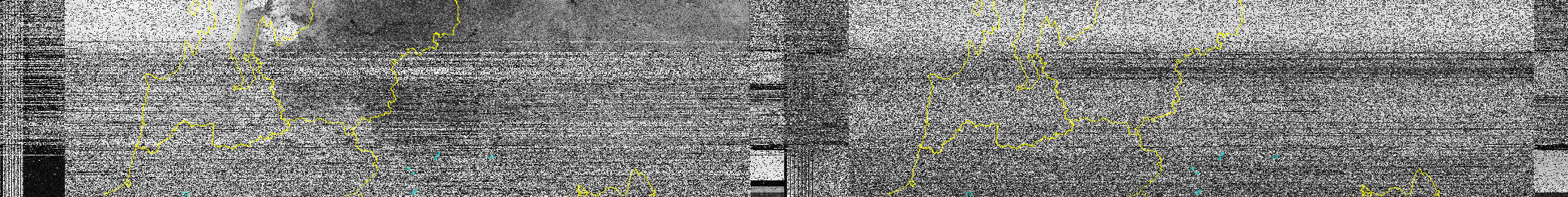
While still only a slice of image amongst a good amount of static, it was exciting to see some atmosphere emerge in these:
Process
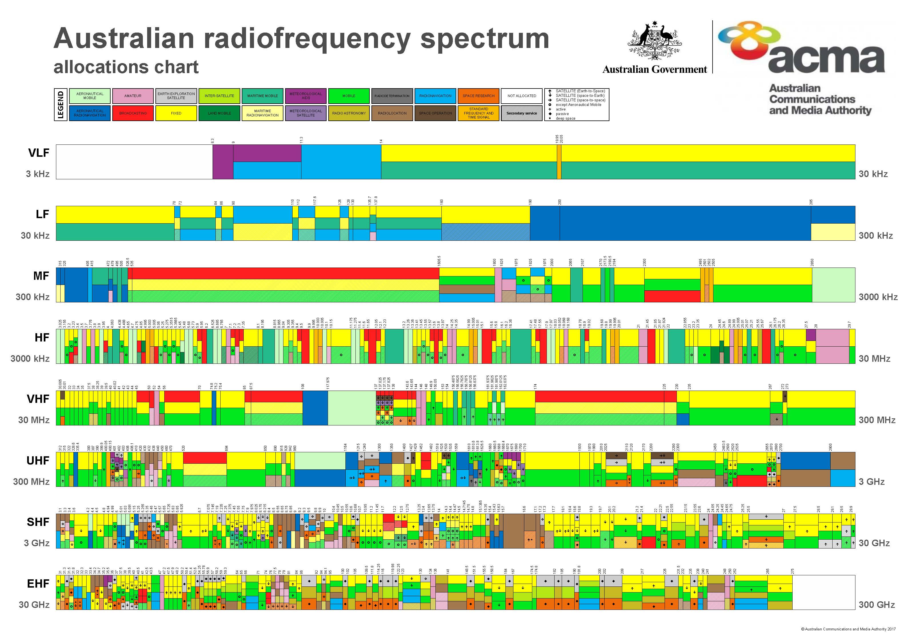
RTL-SDR is a ‘software-defined’ radio scanner with a digital converter that allows access to the radio spectrum through a laptop.
Following Brad’s guidelines I was aiming to tune into the frequencies of National Oceanic and Atmospheric Administration (NOAA) satellites with CubicSDR, record the audio, then use WXtoImg to translate that audio file into a satellite image.
Software and set-up
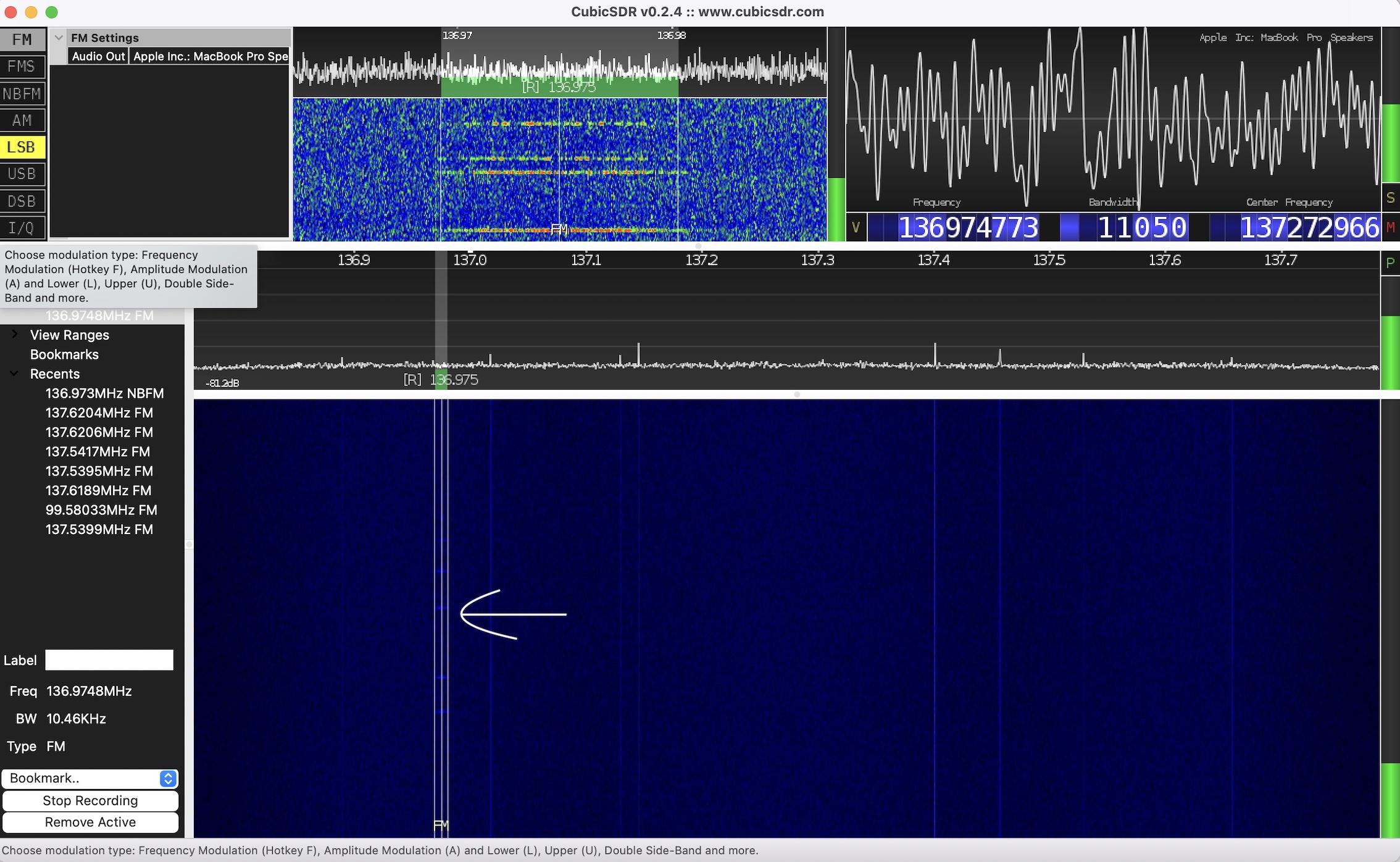
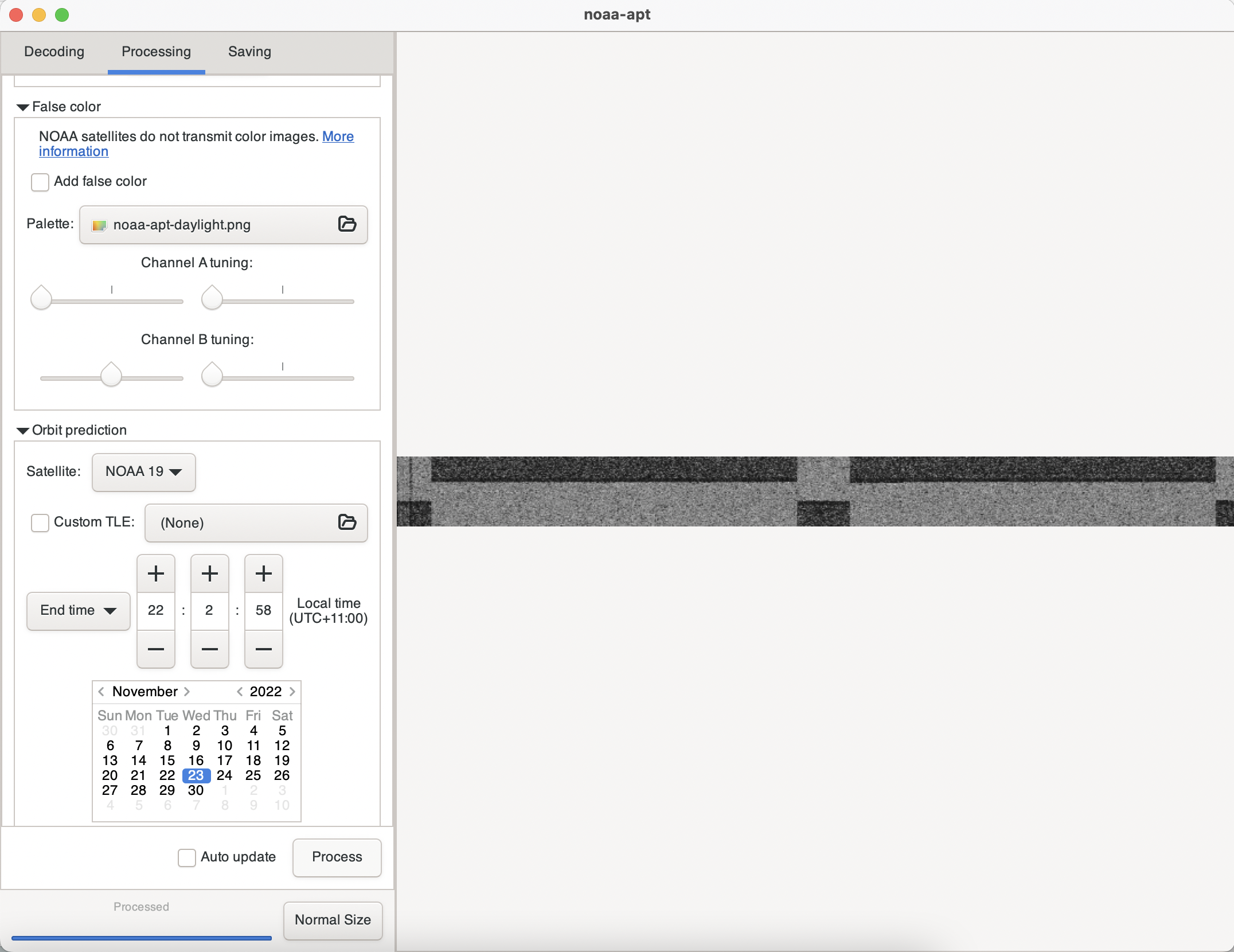
The first hurdle was outdated and incompatible software. I ended up using noaa-apt image decoder instead of WXtoImg, installing it for MacOS using this tutorial and trying out Gqrx SDR for recording before going back to CubicSDR.
Frequencies
NOAA satellites are unlocked so anyone can access their data by tuning into the following signals:
-
- NOAA 15: 137.62MHz
- NOAA 18: 137.9125MHz
- NOAA 19: 137.1MHz
Tracking satellite passes
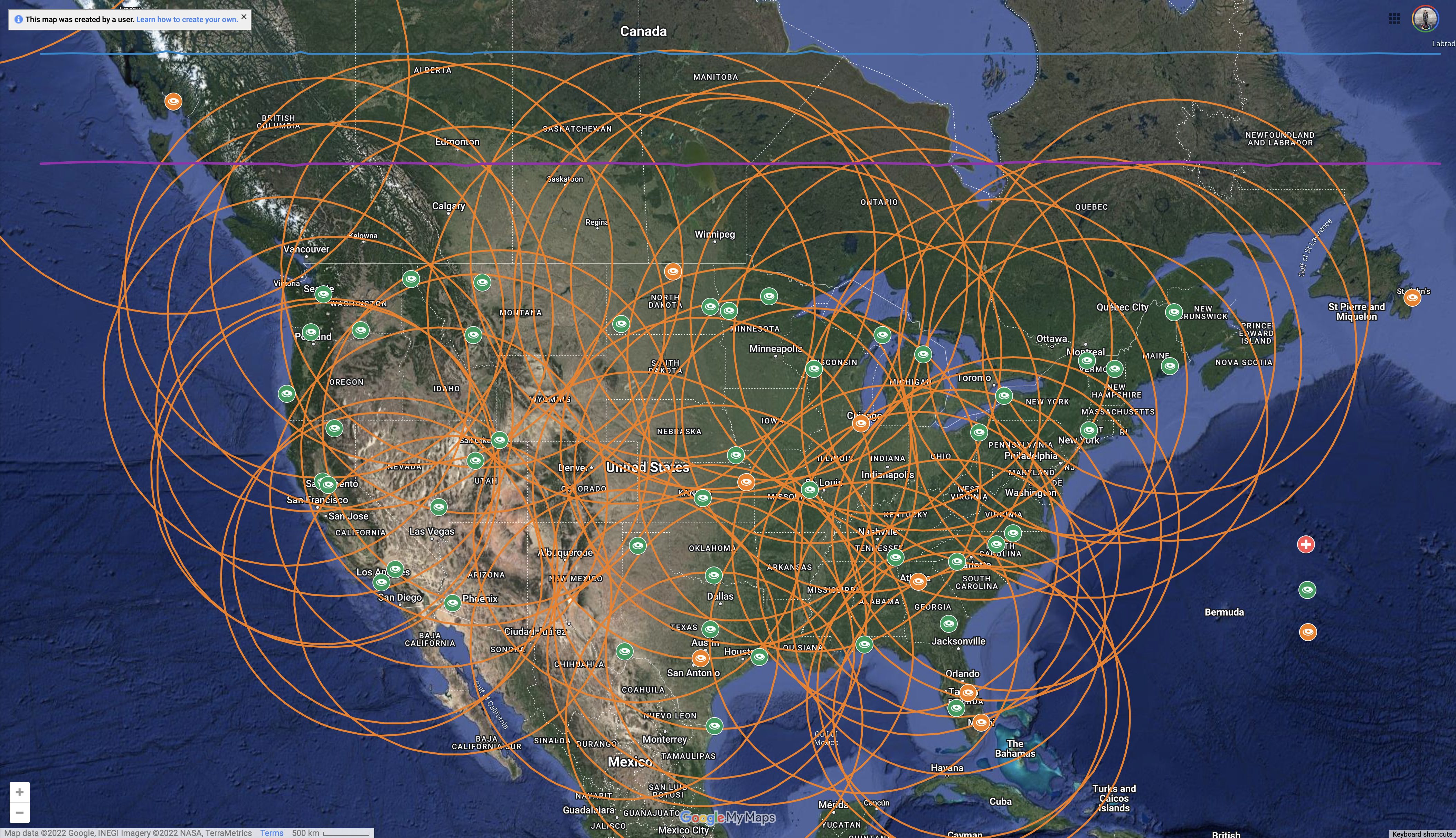
To track these three NOAA satellites, I was using n2yo.com which shows the timing and maps of their predicted passes. I had to keep reminding myself that ‘visible passes’ refers to us seeing the satellite (or their reflected sunlight at dusk / night time) where as I was aiming for the opposite, and that the ‘invisible’ passes in daylight would be better for seeing from the satellite’s perspective.
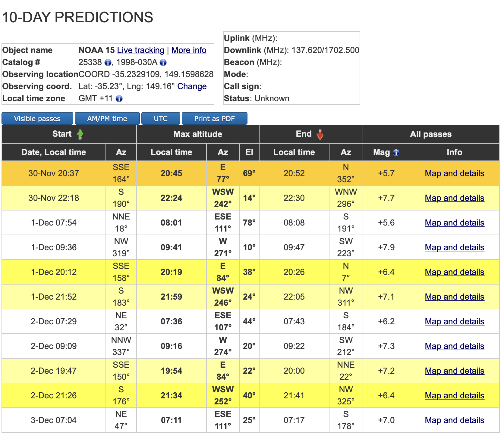
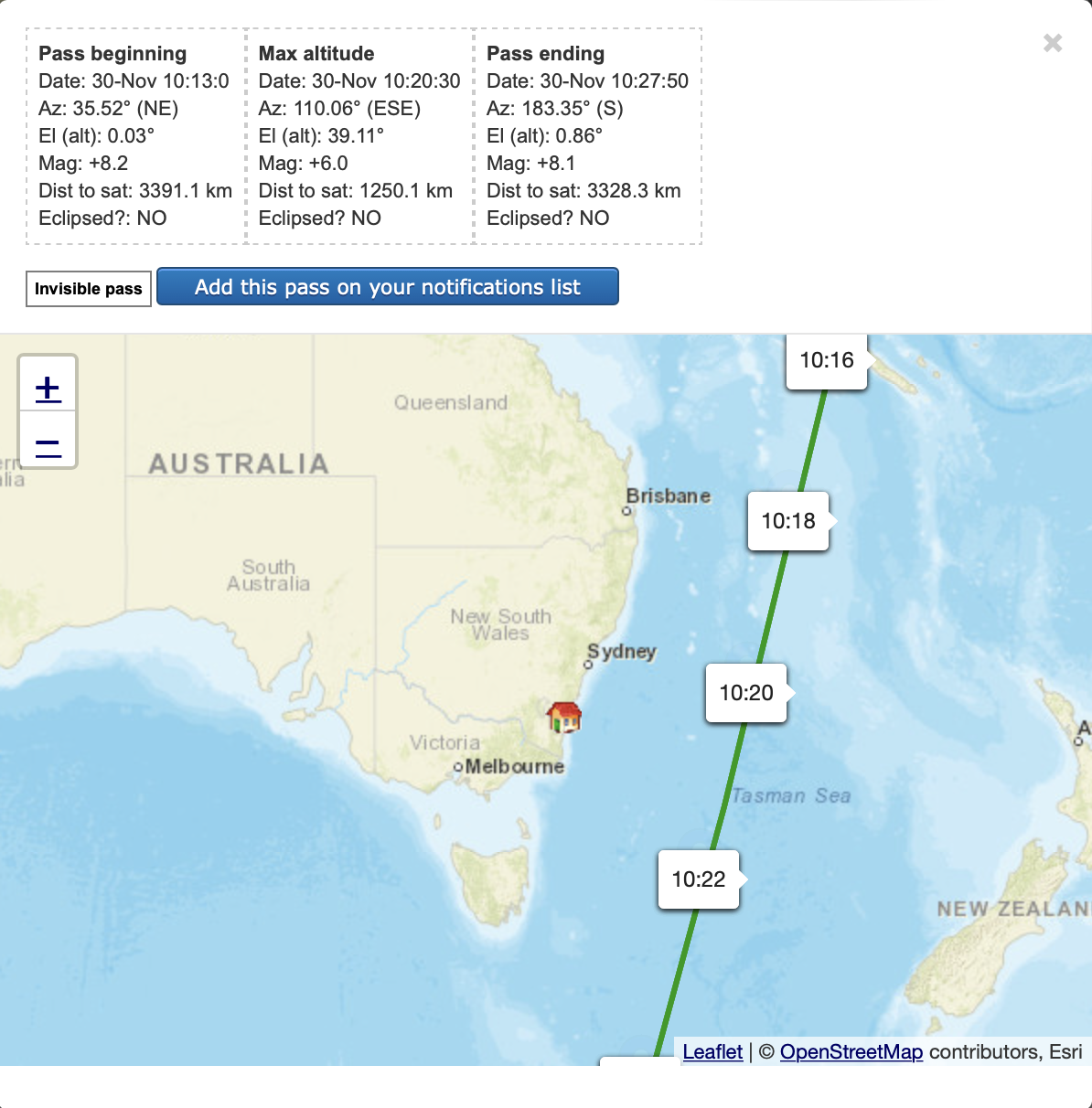
In hindsight, I have realised that my failed attempts were probably just because the satellites were way too far away. The pass shown in the map above was not close enough to get a useful signal, the successful ones were slightly closer than this.
Noise > Signal
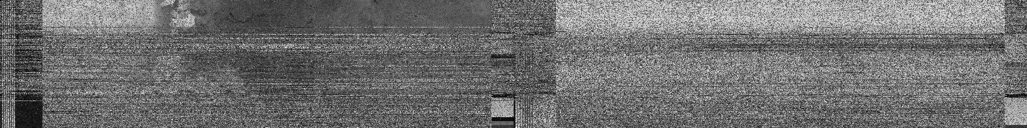
These were many failed attempts where I captured recordings that gave errors or were just not satellites. For example..
Single line:
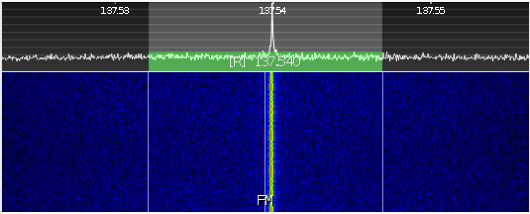
Blips:
Triple j playing Gang of Youths Live at the Wireless (a nice surprise and a gig I was actually at! – but not a weather satellite)
Recording the singe line or blip frequencies were giving me wav files full of static:
Recording the single line or blip frequencies were giving me wav files full of static that would be decoded into images equally full of static or with occasional blocks of contrast.
Leaving the recording on for 4 hours before going out hours created an image 11 metres long 😂

Noise < Signal
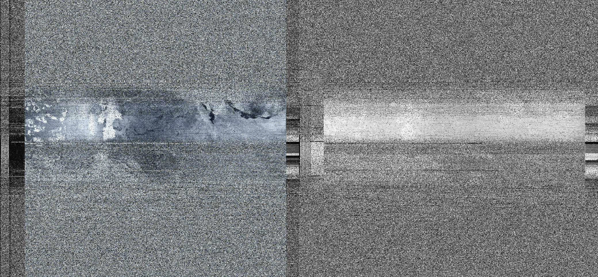
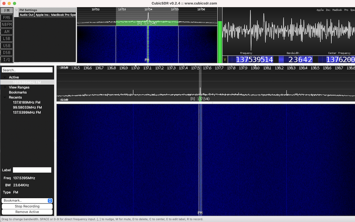
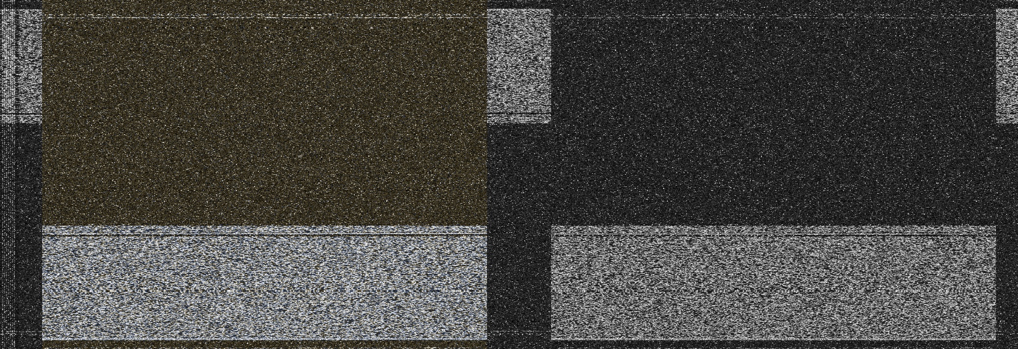
After more experiments with different settings, sample rates, and bandwidth I finally encountered a defined, strong signal of both NOAA 15 and 19, which looked like this:
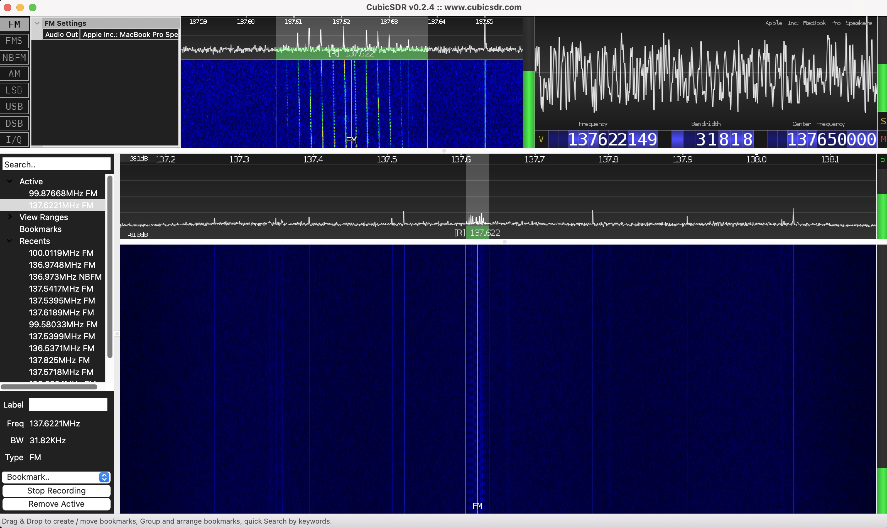
And sounded like this:
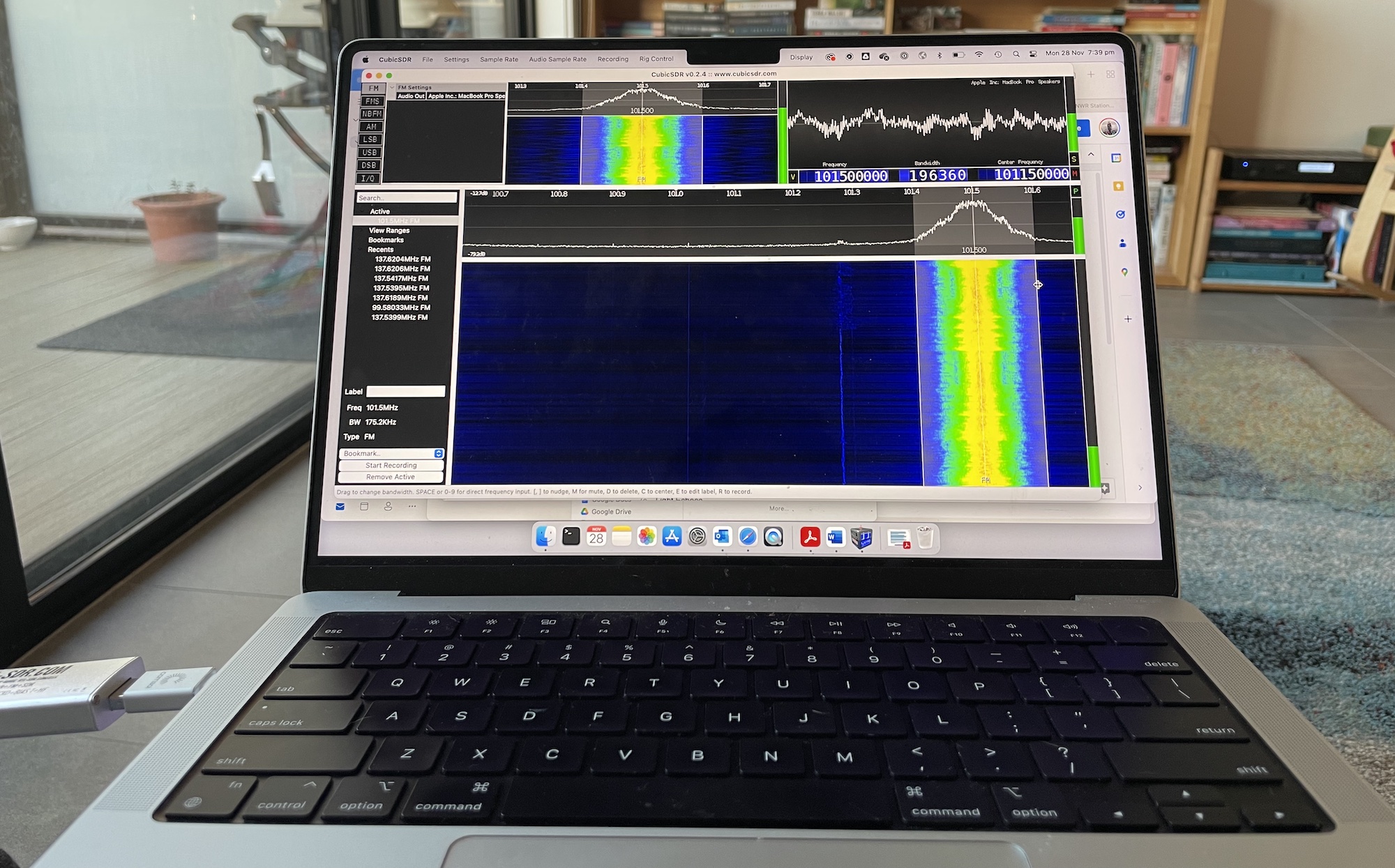
Note antenna set up on balcony cabled through dog door (convenient!)
I made three recordings like this which produced the following images using noaa-apt with varying processing settings.
NOAA 15 with synced frames, without map overlay:
NOAA 15 with synced frames, histogram settings to increase contrast, and map overlay:
NOAA 19, no extra settings:
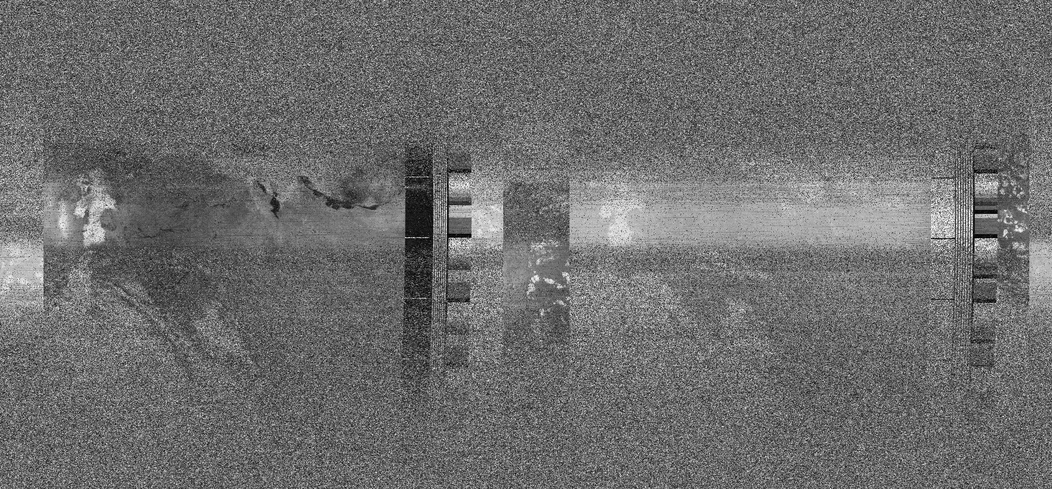
NOAA 19 with histogram and false colour applied: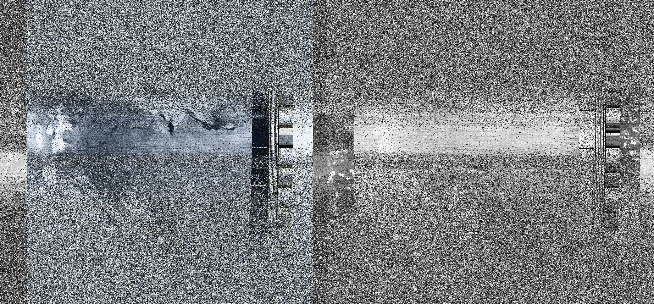
NOAA 19 with synced frames, histogram and false colour applied:
Technical notes
The NOAA User’s Guide for Building and Operating Environmental Satellite Receiving Stations was useful for understanding some of the technical elements of this process.
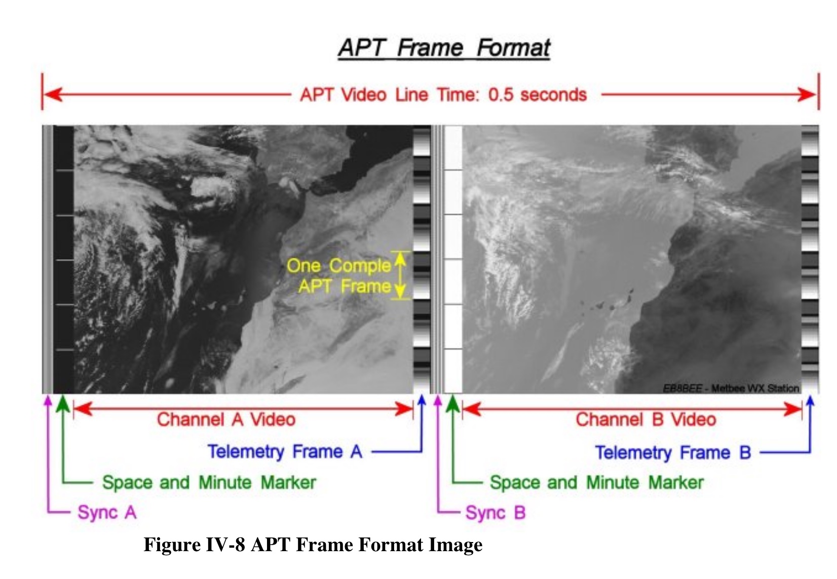
Two channels
Automatic Picture Transmissions (APT) is designed to broadcast direct satellite imagery to low-cost ground receiving equipment, by sending only two channels of high-resolution imagery, which explains the double imagery produced.
“The two images that appear in the APT are selected from ground control and, during daylight passes, usually consist of the visual channel and one of the infrared channels. At night, two infrared images are usually found in the APT. Therefore, the final product from APT consists of two images, side by side, representing the same view of the Earth in two different spectral bands.”
APT signal is continuously transmitted, creating an image strip that represents the time of transmission as the satellite passes overhead.
Telemetry
“IR Telemetry – At the end of the IR line is a zone dedicated to telemetry information. This data is coded as step-like changes in brightness, resulting in a strip down the right side of the IR image made up of gray scale step “wedges.” This information is used for calibrating temperature data in the image.
Visible Light Telemetry – The visible scan line ends with a telemetry window similar, but not identical, to the IR telemetry wedges.”
Bandwidth
I played around a lot with the bandwidth in different recordings, trying to make it wide enough to get the right signal / noise ratio, by placing the grey area just around the signal. The NOAA user’s guide indicates it should be around 40 KHz which ended up being right for my recordings.
Other settings are described in Image Data Acquisition for NOAA 18 and NOAA 19 Weather Satellites Using QFH Antenna and RTL-SDR by Wiryadinata et al, 2018.
Now I’ve got the basics working I am hoping to use this process to look at both frequency interference (starting to look more at the unwanted signals with more intention) and also to think more deeply around the recursive relationship between what satellites see, and what we see of them.


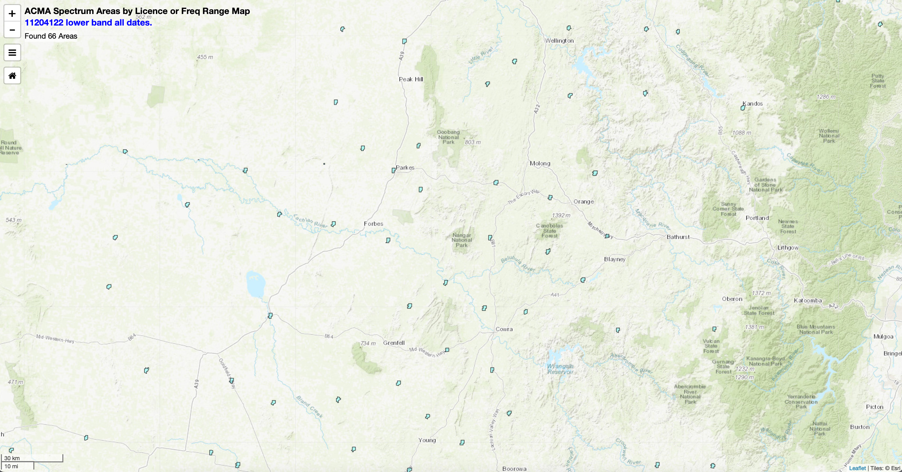

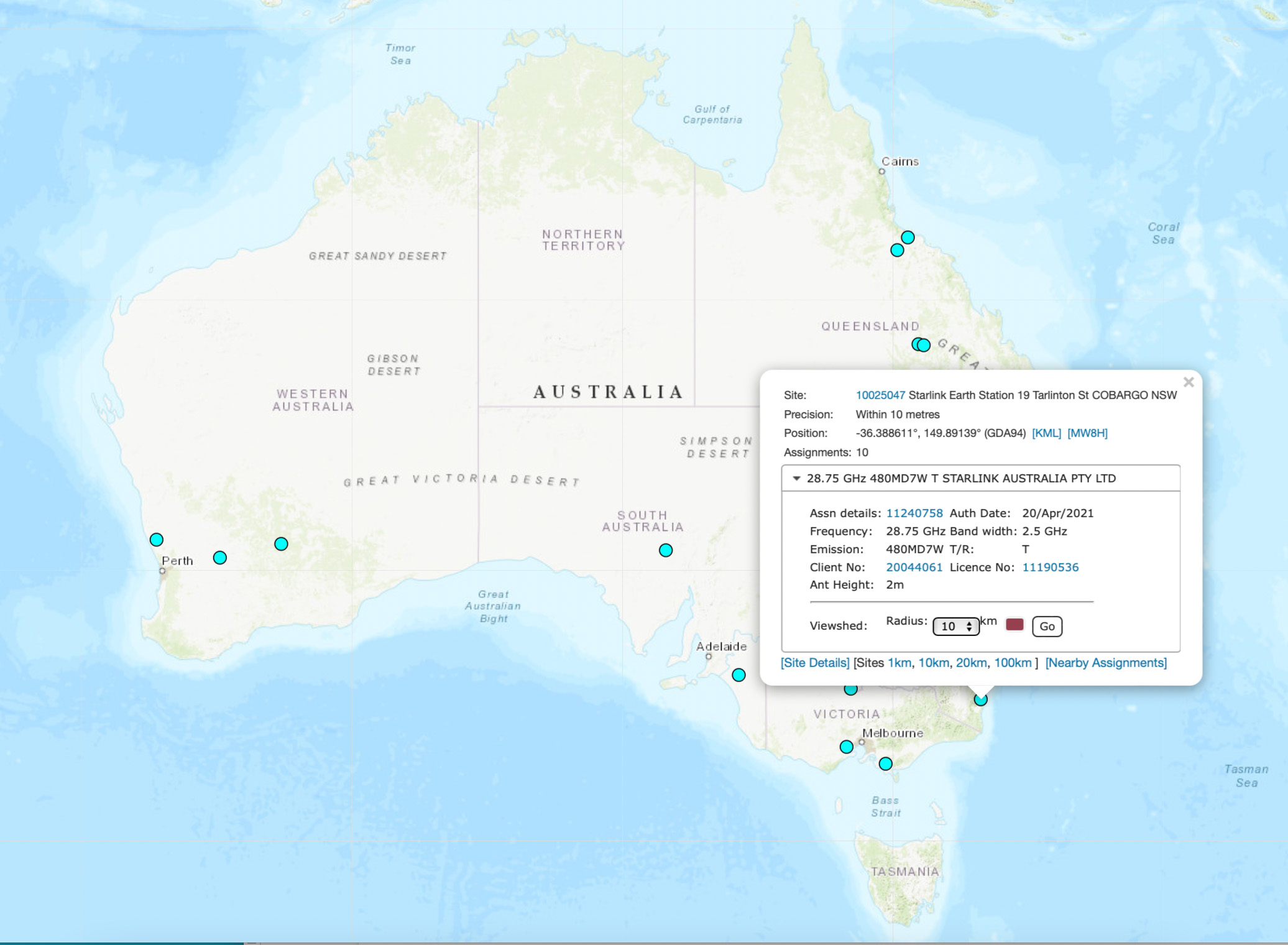
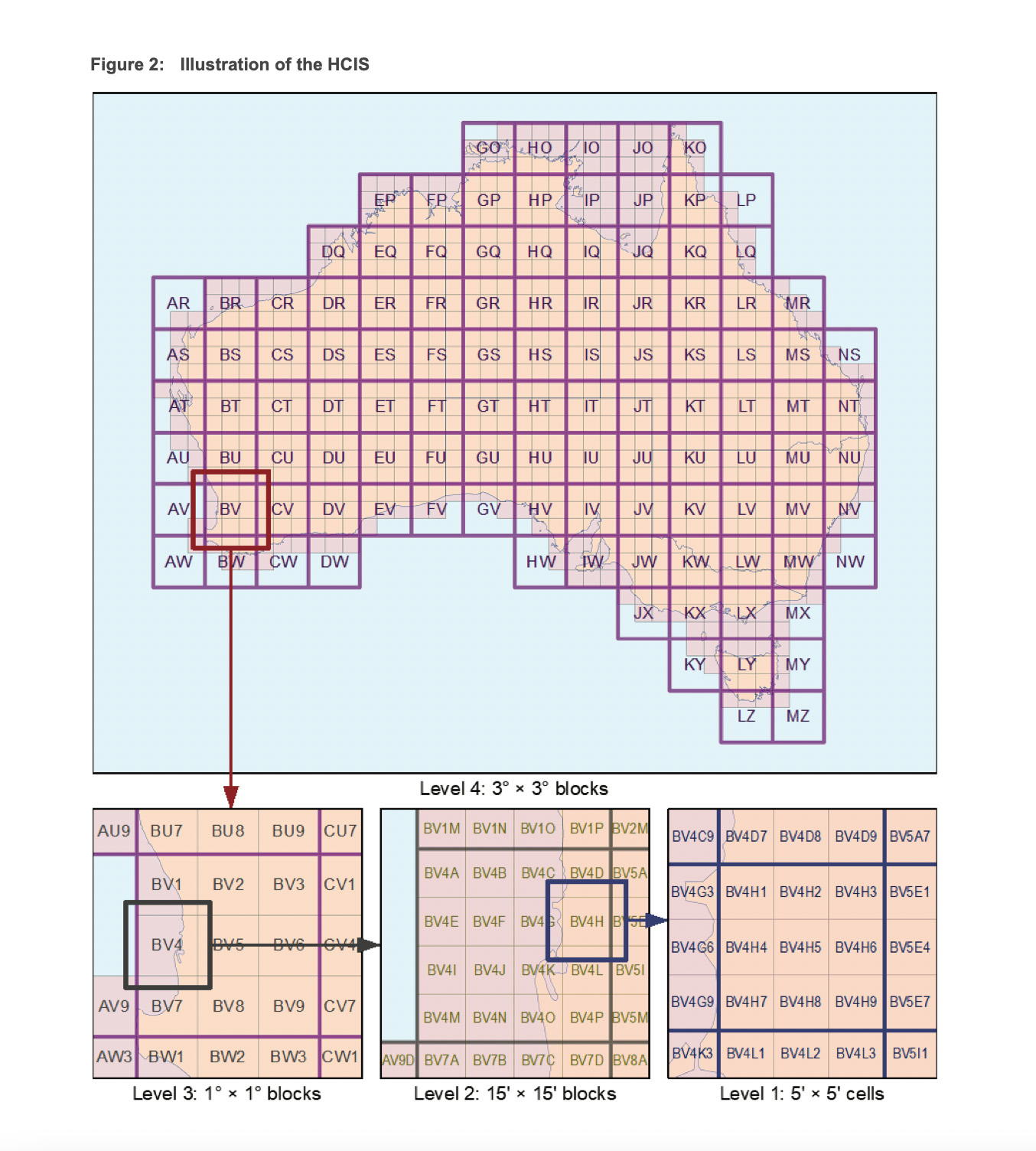


 Broken Hill, NSW.