FITS Images

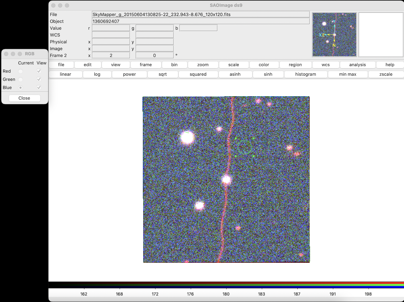
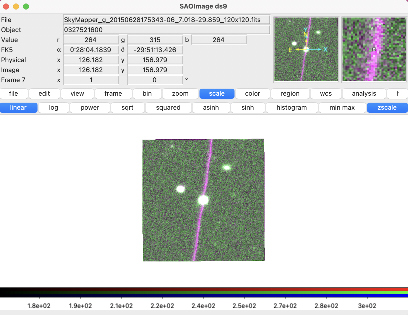
This past week I began using astronomy software SOA ds9 to look at satellite contaminated images from Skymapper, in FITS format.

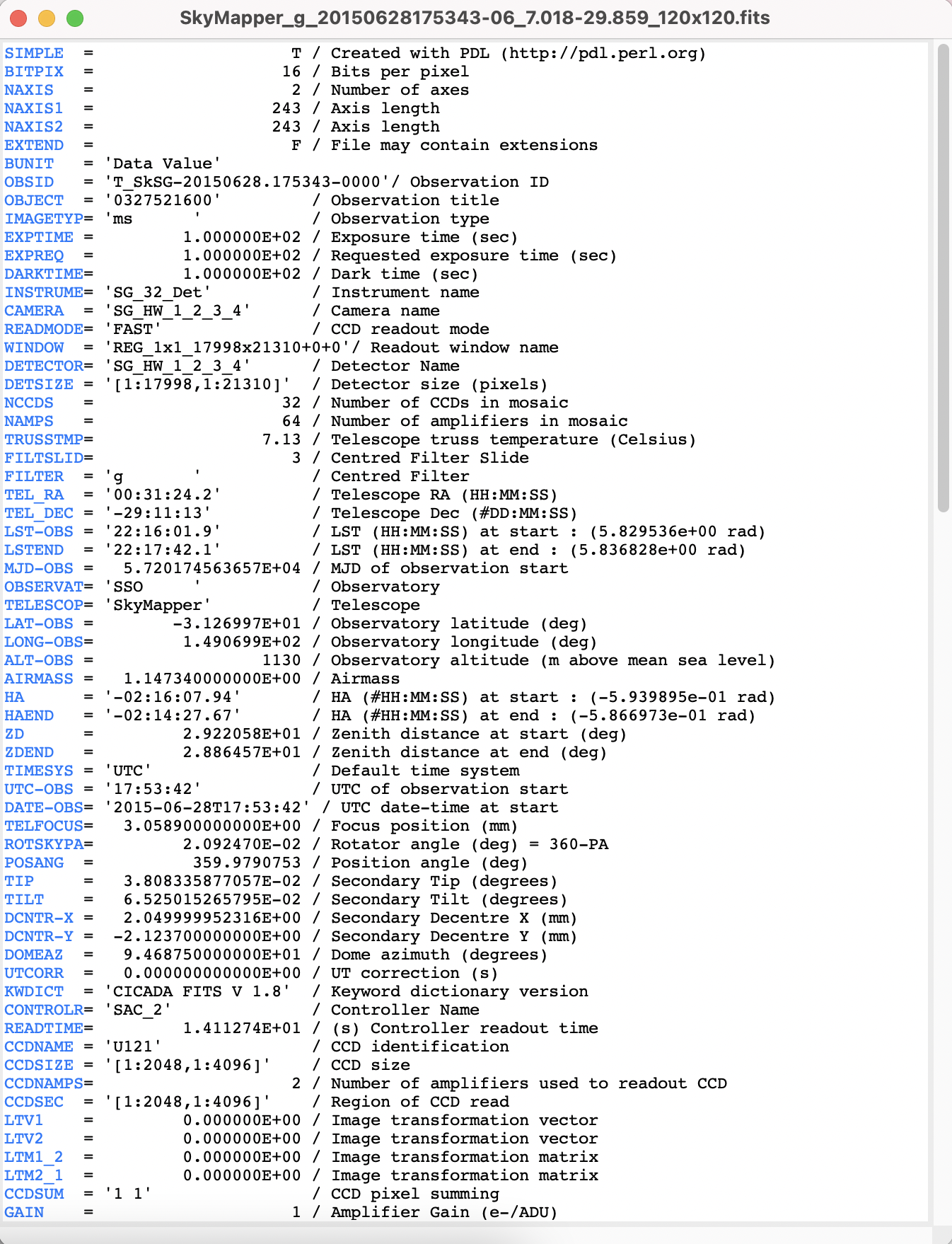
Different from typical image files, FITS  (Flexible Image Transport System) is an archival data format that stores information such as spectra, lists, tables, or arrays, instead or as well as ‘images’. SOA ds9 is an application designed for working with image data in this format. The FITS file comes with a ‘Header’ that contains stacks of metadata, here’s an excerpt:

A screenshot of the FITS Header metadata

Since astronomical images measure the intensity of light rather than a defined colour, they are grayscale and appear differently dependending on the band of filter used (and frequency captured). Ds9 can open these files and combine them into frames that correlate and/or separate this information.

I have been trying a very basic function of doing this by combining FITS files of the same sky object captured in different bands, into a colour image in RGB channels. This involves layering the red, green, blue, channels together. Sounds simple enough… (twist! It’s not)

I originally charged ahead using the ‘r’ band for red and ‘g’ band for green. When I asked Brad where the ‘blue’ channel was, he explained (reminding me patiently) that it’s spectrum that we’re working with, not colour. 

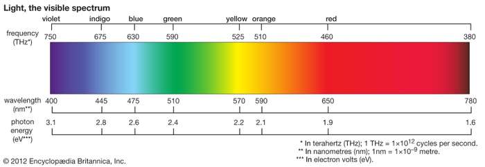
In the light spectrum, what we see as blue has wavelengths between about 450 and 495 nanometers, green from 450 to 570, and red from 620 to 750.

A graph of the colour spectrum

Different telescopes have different filter profiles according to what they are trying to measure. SkyMapper filters are plotted on this graph:

A graph of the SkyMapper filter wavelengths

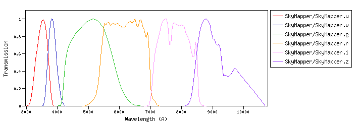
Comparing these graphs was useful for me in thinking through how the different bands are translated to RGB channels due to their wavelengths on the light spectrum.

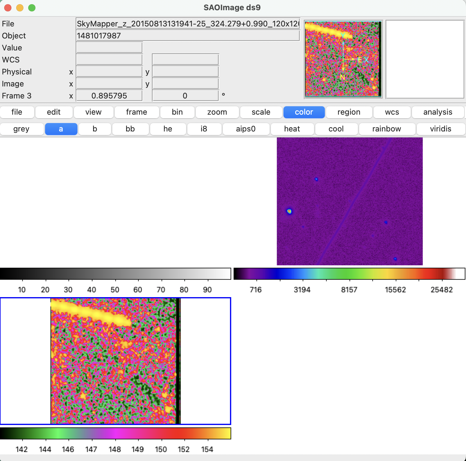
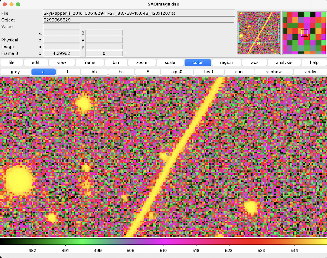
So when making an RGB image from SkyMapper FITS files in ds9, I used the i band for the red channel, the r band for the green channel, and g band for the blue filter. 

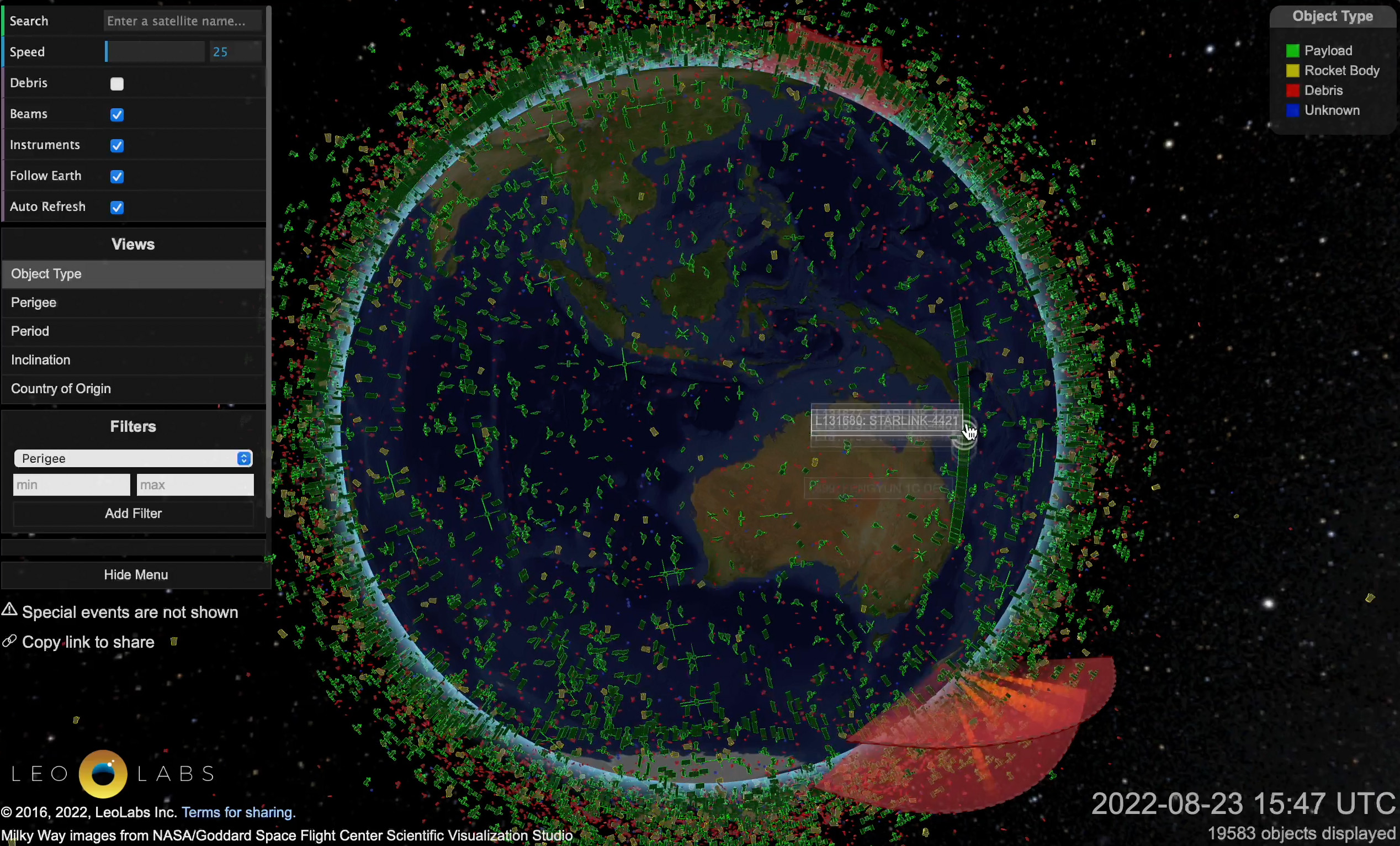
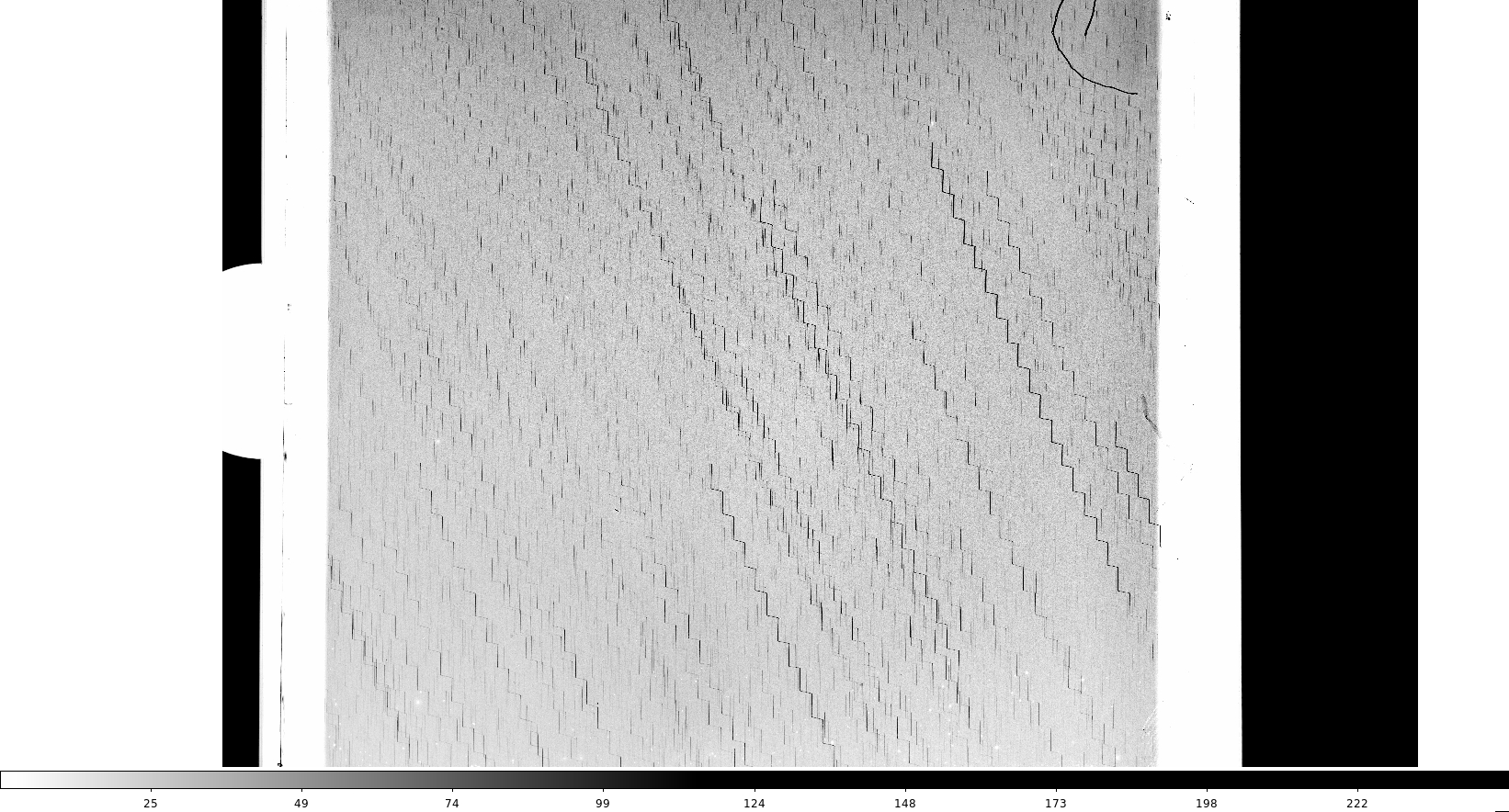
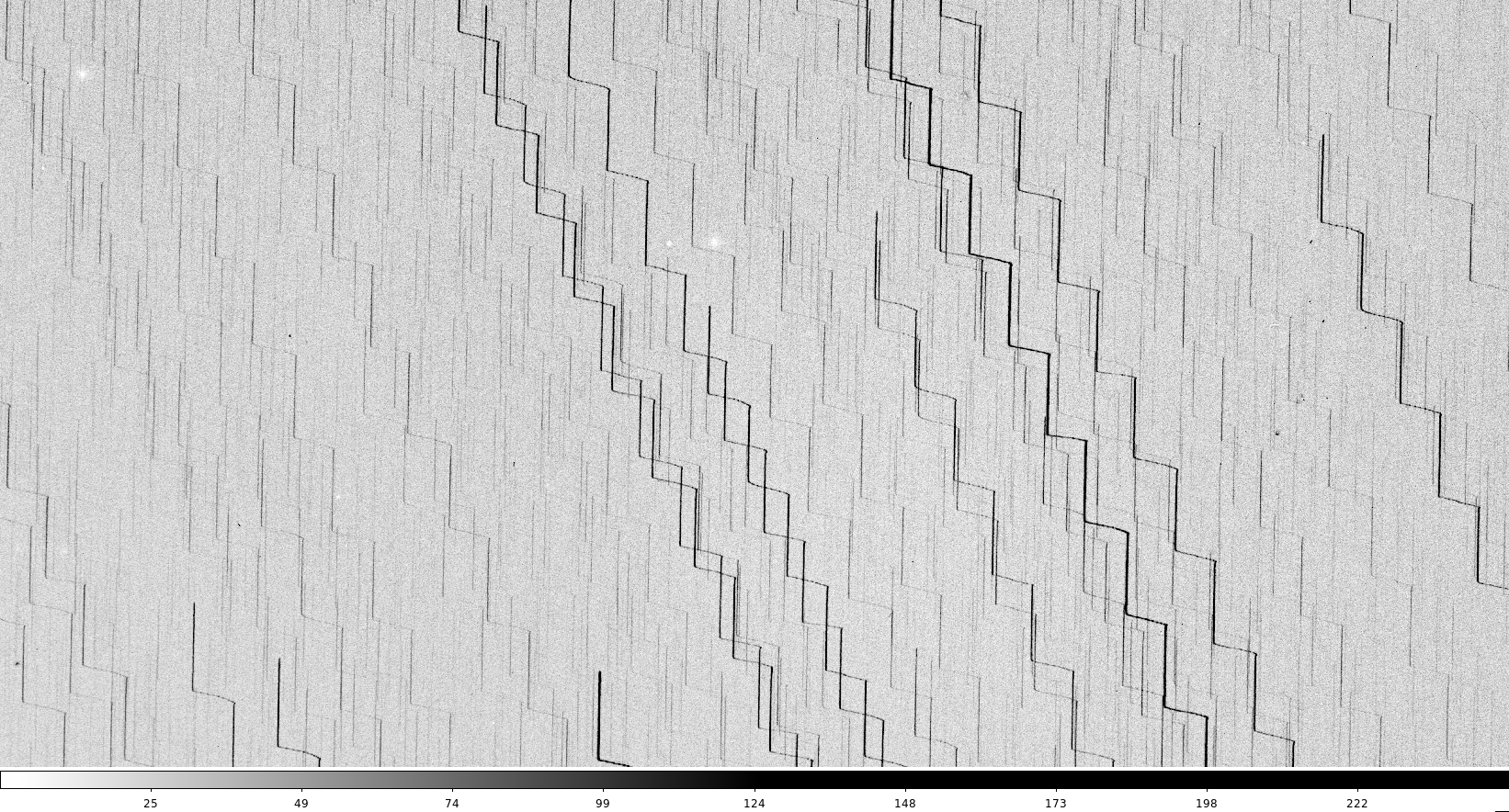
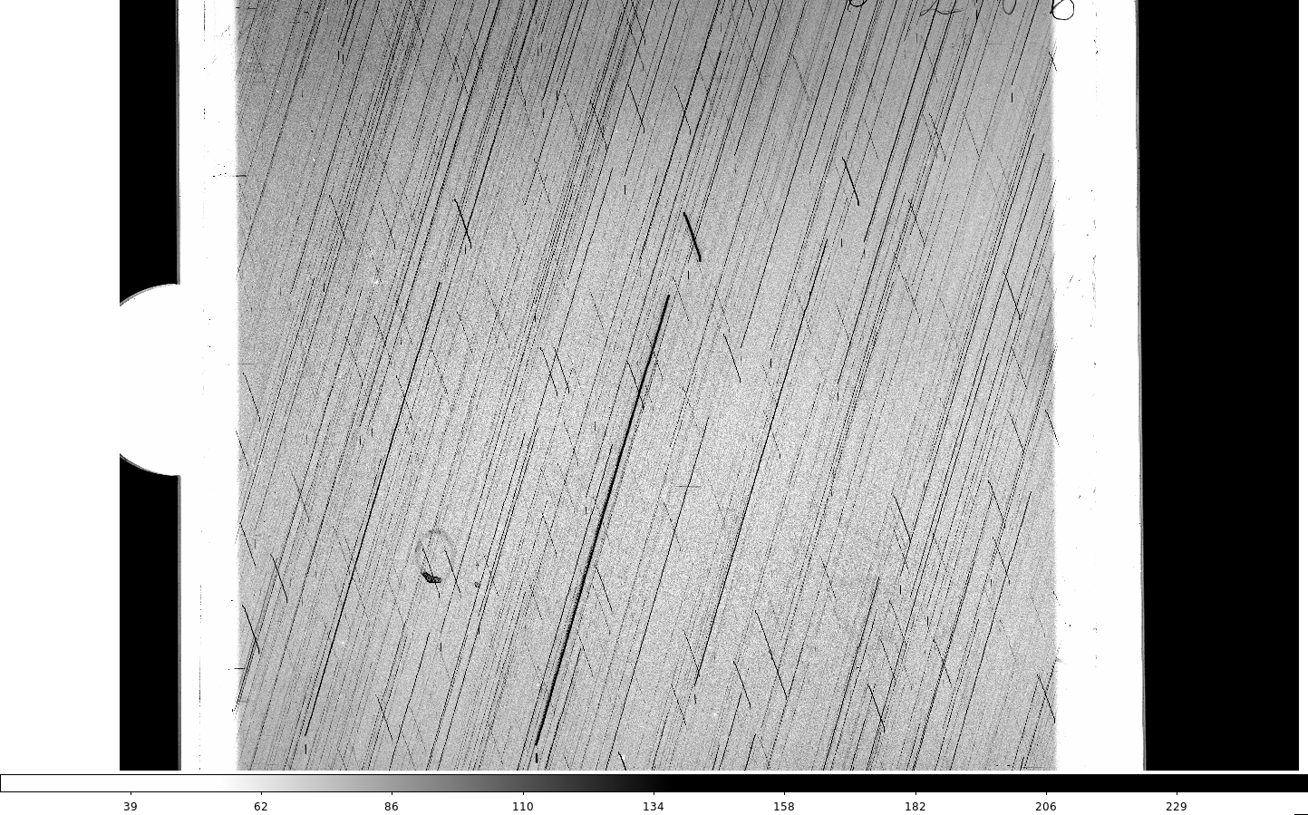
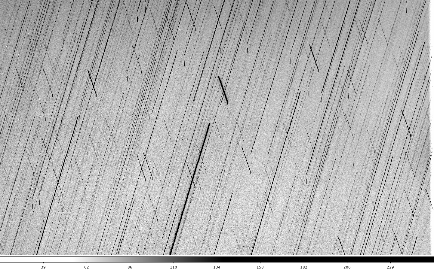
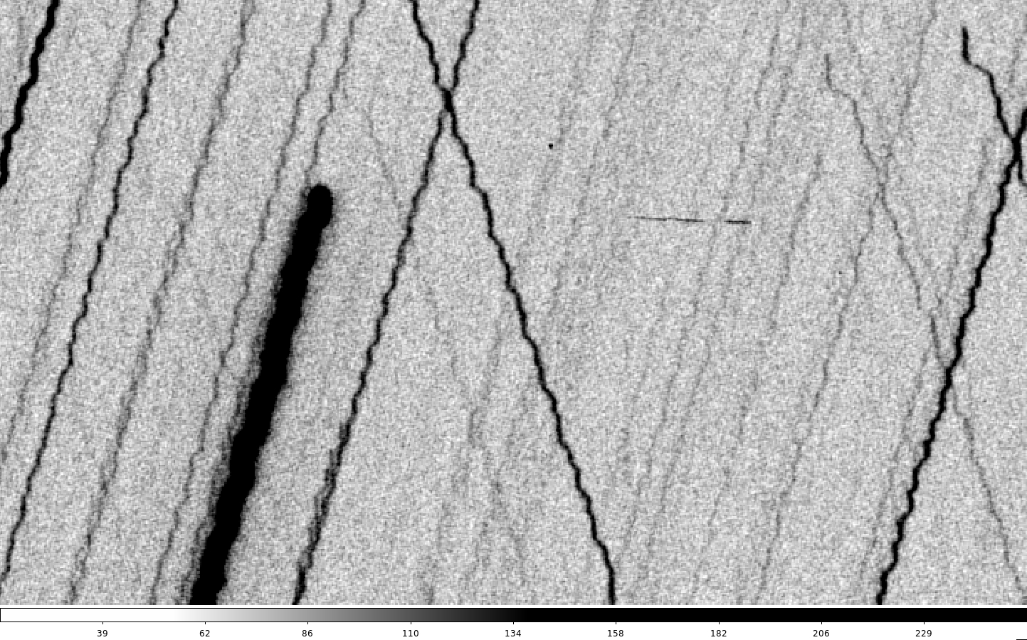
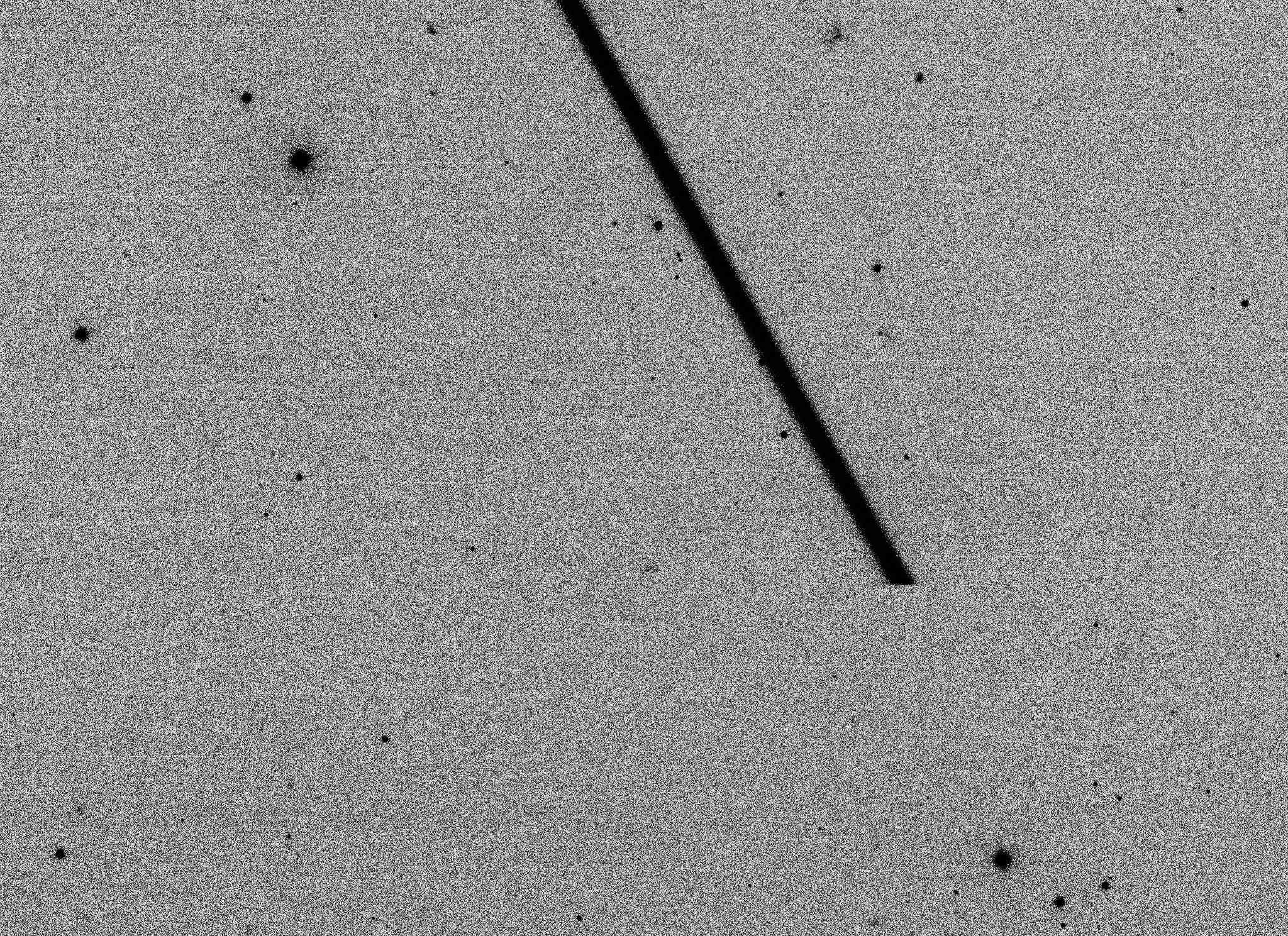
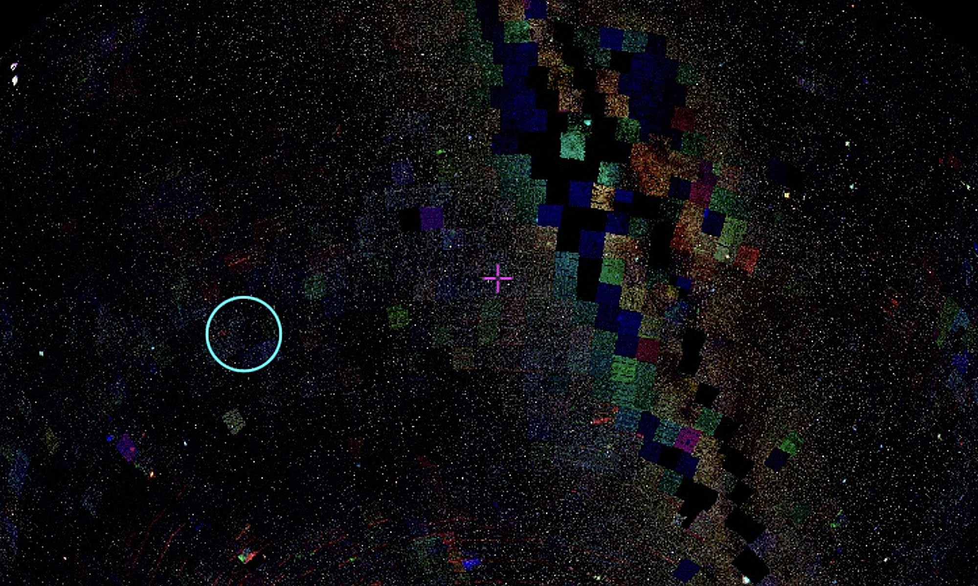
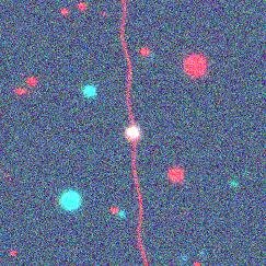
These are two contaminated SkyMapper cutouts converted in this way:

A satellite streak image with static and colour tint

A satellite streak image with static and colour tint

A screenshot of the ds9 interface

A screenshot of the ds9 interface

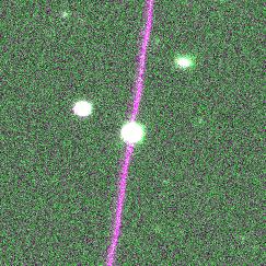
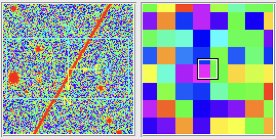
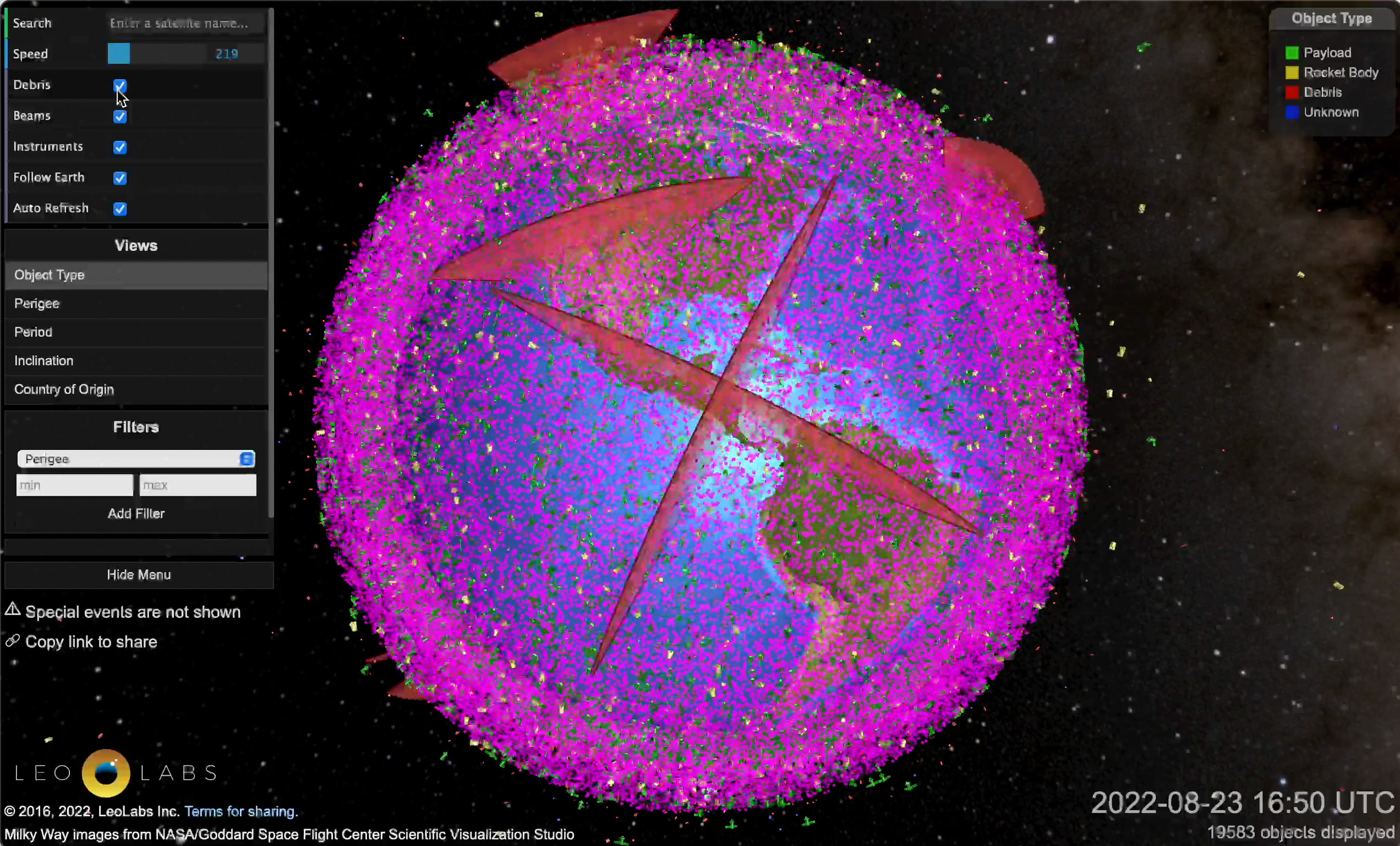
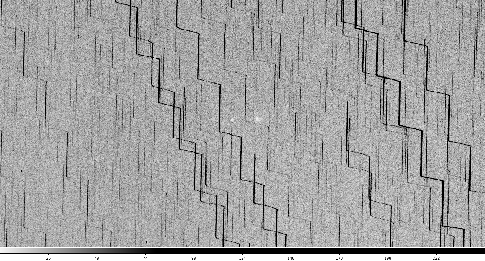
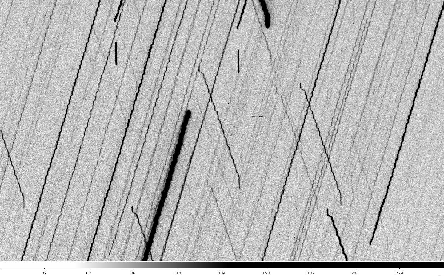
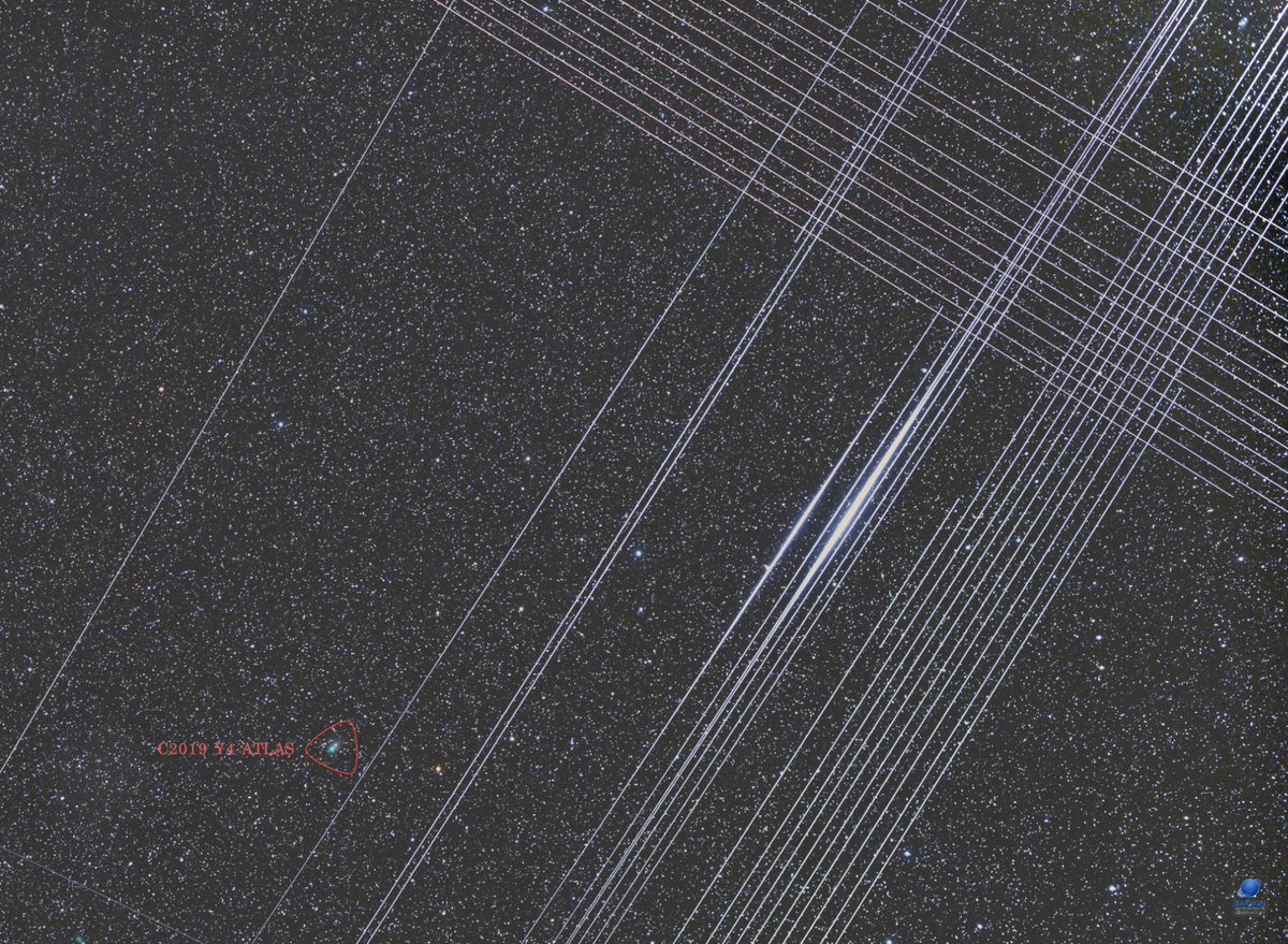
And here are some more made from simply messing around with a new imaging format with no rhyme or reason:

Screenshot of a pixelated satellite streak image

A screenshot of the ds9 interface

A screenshot of the ds9 interface

Space Situational Awareness

The shaky star images led me to ask Brad how we would go about creating such images now. I was thinking visually, of images that capture the hand-tremor of a human observer, but this unleashed the topic of Space Situational Awareness (SSA) – the massive, global, effort to track and be familiar with the environment of dynamic objects in space.

The recent increase in satellites means there is also an increase in radars watching satellites. This is a huge and multi-pronged industry which immediately brings up the military uses and reasons for tracking satellites – and also a completely different method and aesthetic of visualising them. 

An increasing number of companies offer services specifically for  producing high-res interactive visualisations of the satellites that astronomers actively avoid. I am interested in how a single satellite can be captured visually in such starkly different ways, and how the resulting representation encapsulates vastly different world views.

These are some screenshots from a quick but thought-provoking zoom around LeoLabs:

A visualisation of satellites in spaceGreen objects: satellites currently in space.
Red shapes: Leo Labs’ tracking radars.

A visualisation of satellites in space
The straight line of satellites in this image are Starlink.


Pink objects: space debri 😧

Visualisation of satellites in spaceAustralian owned satellites.


US owned satellites.

Shaky stars

These images were found in a collection of photographic slides from 1963, part of an archive currently being digitised at Mt Stromlo Observatory.

While at first they don’t look like anything of interest, Brad mentioned them to me because they actually contain a satellite, indicated on the slide envelopes as Syncom 1, NASA’s first geosynchronous communication satellite. Although contact was lost with Syncom 1 five hours after launch, it was sighted on 1st March 1963 from Boyden Observatory at Bloemfontein, South Africa, two days before this first slide was taken.

These images represent an intriguing shift in focus. Because the satellite is the intended subject, the stars are blurred. This creates an effect similar to satellite contamination as we are familiar with now, but from the opposite cause.

It flips the temporal relationship: rather an exposure time relevant to the motion of stars that satellites zoom past, in this image the timescale is recalibrated to the speed of a satellite. The shakiness of the line then translates directly to the observer’s hand as they traversed the sky. The way the stars move in different directions suggests how the observer moved the viewfinder to find the satellite, actively seeking out a glimpse of other humans in space.

Star streaks (above), satellite streak (below).

Satellite streak

Starlink satellite streaks
Starlink satellite streaks seen in image by Zdenek Bardon

This seems a compelling reflection of how our relationship with orbital space has shifted. In the older image the trace of the human hand is embedded in the authorship of the photograph. In images like those resulting from Starlink interference, the trace of the human is instead found in a network of technology. The quality of line changes from nuanced and ambiguous to programmed and streamlined, representing a role reversal in whose times we live by.

Syncom 1, NASA's first geosynchronous communication satellite, 1963
Syncom 1, NASA’s first geosynchronous communication satellite, 1963