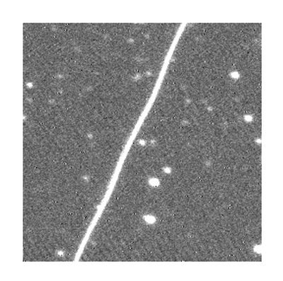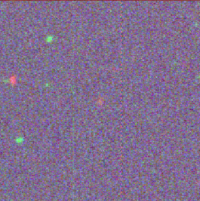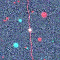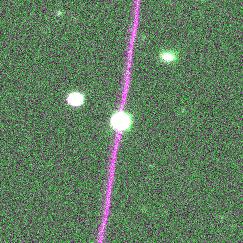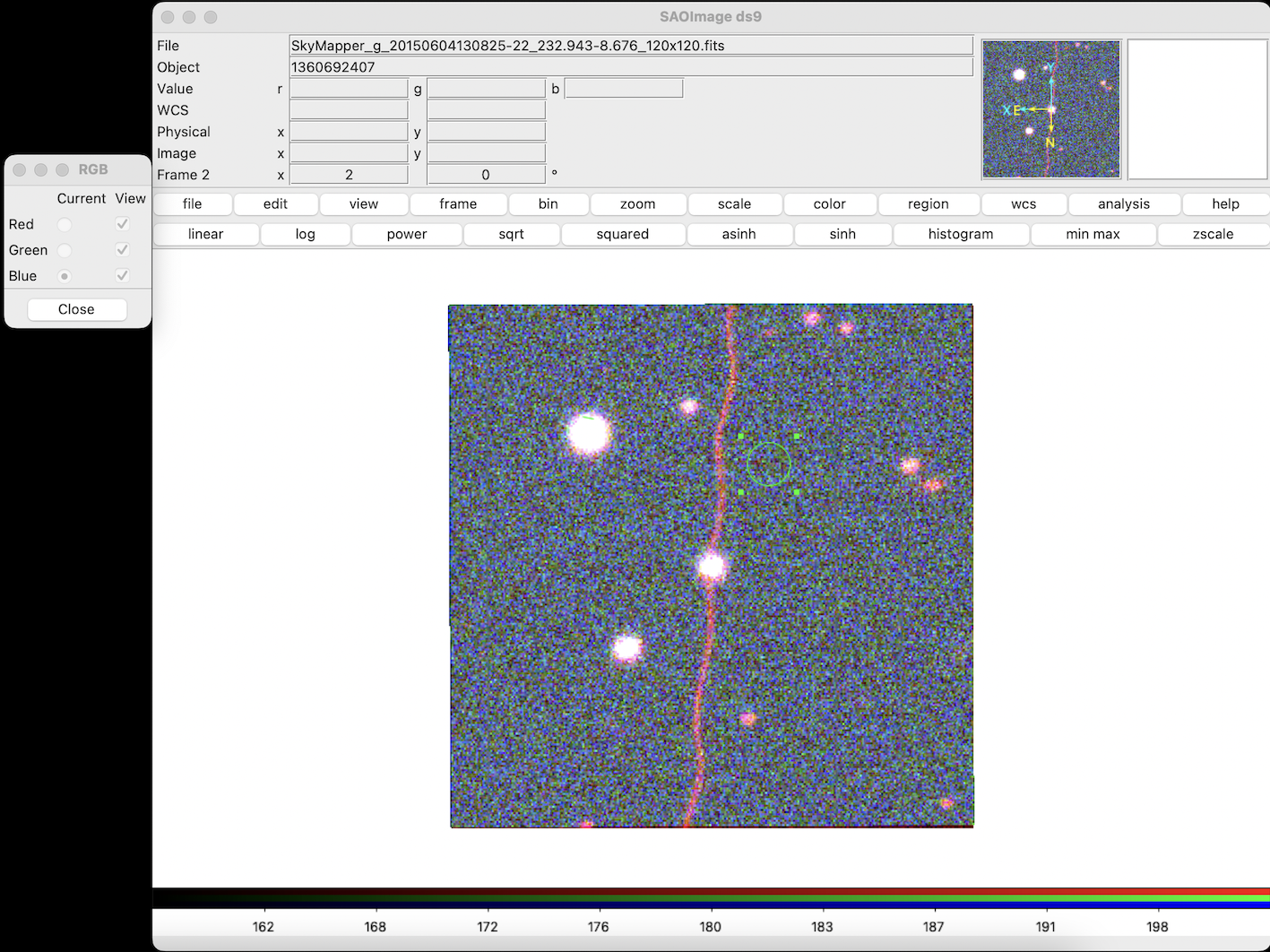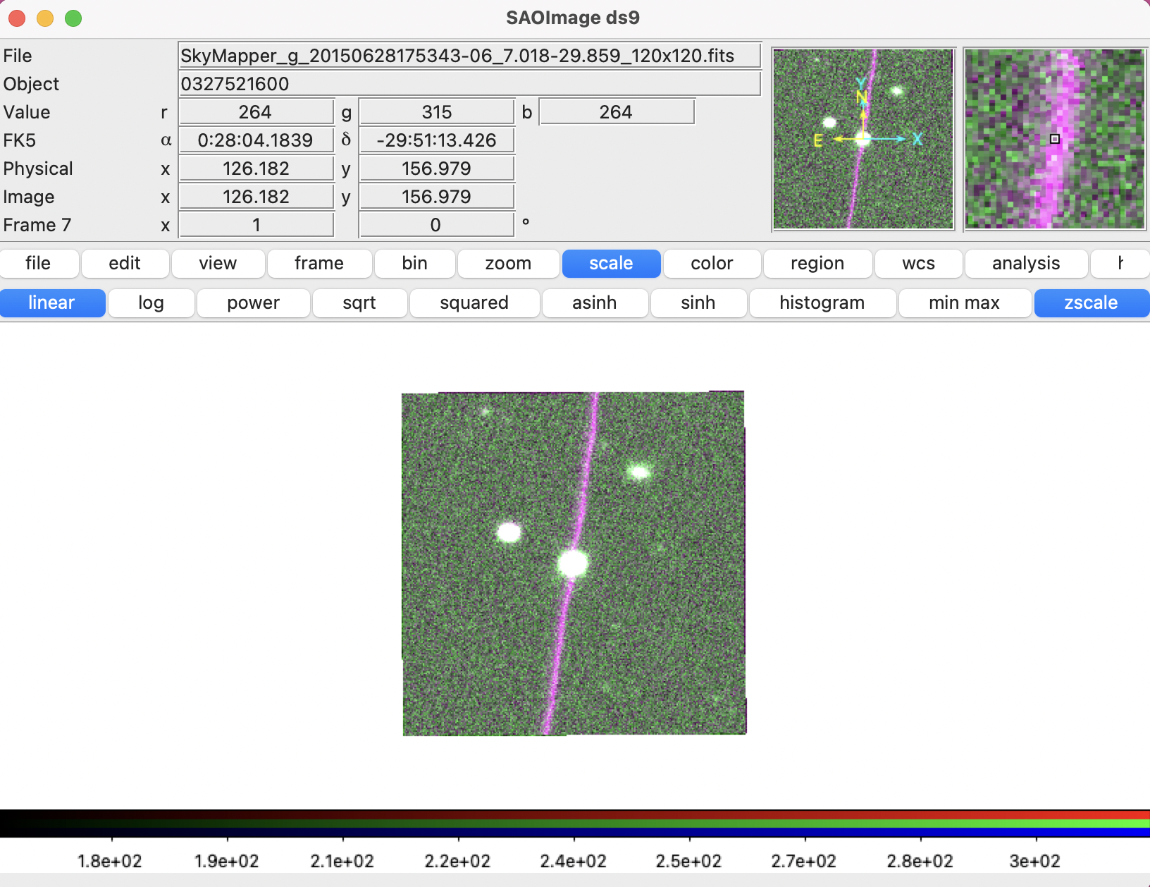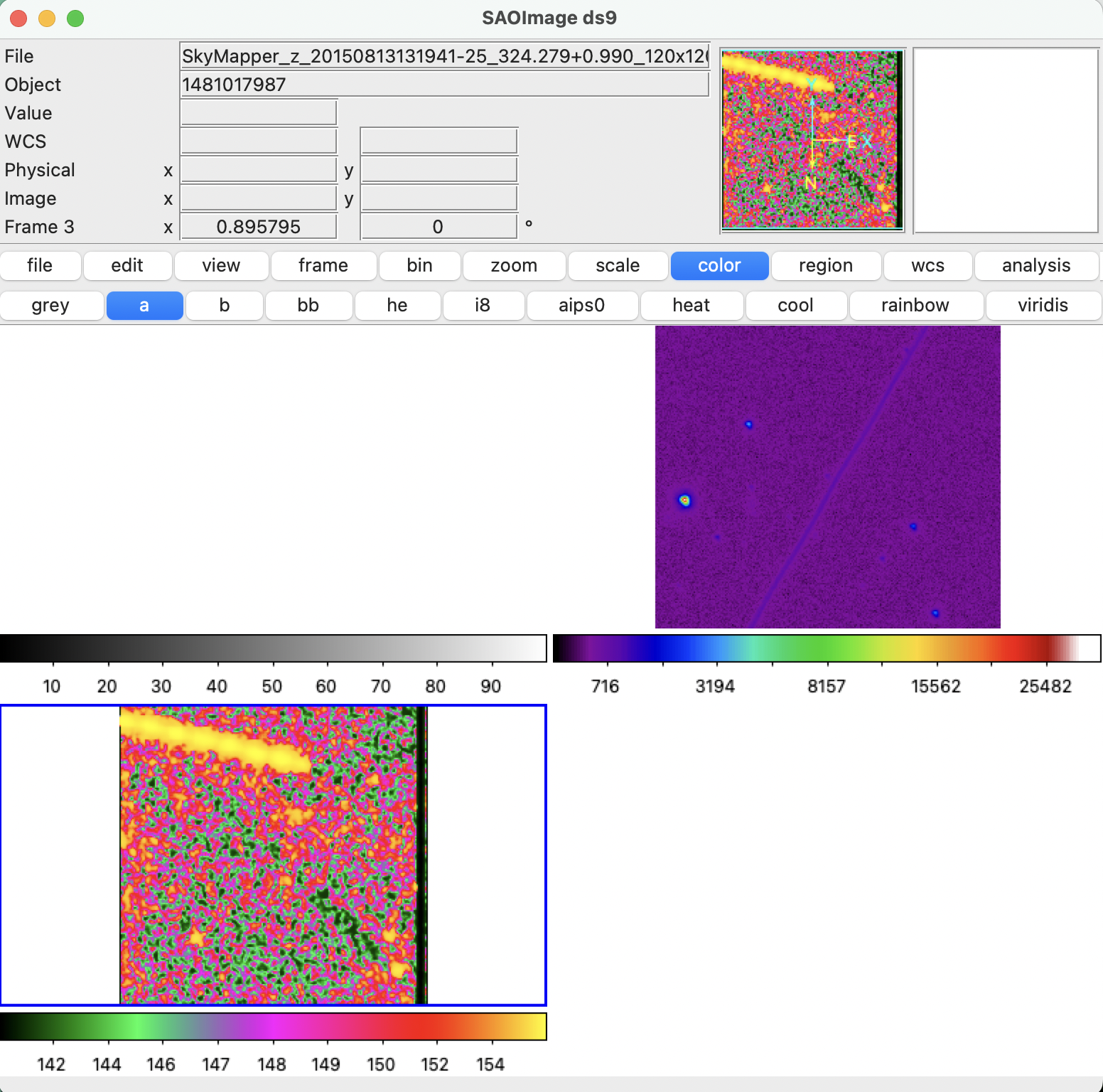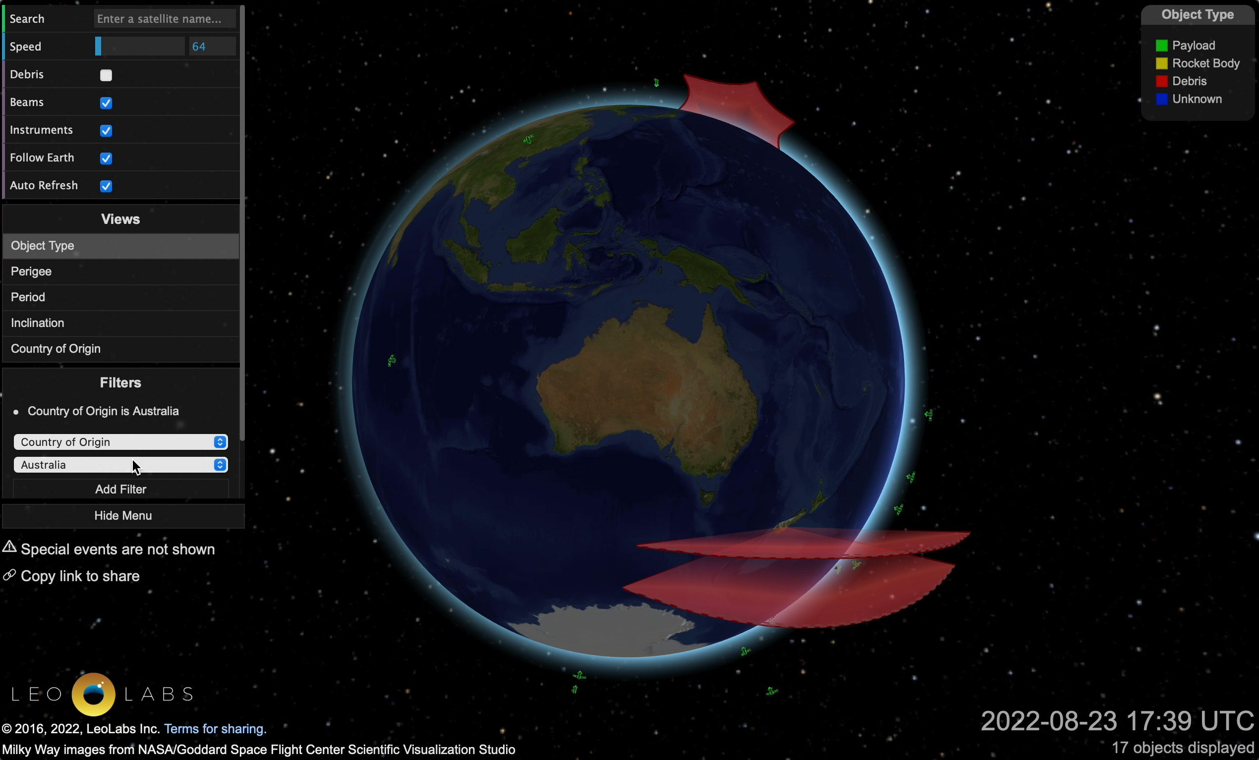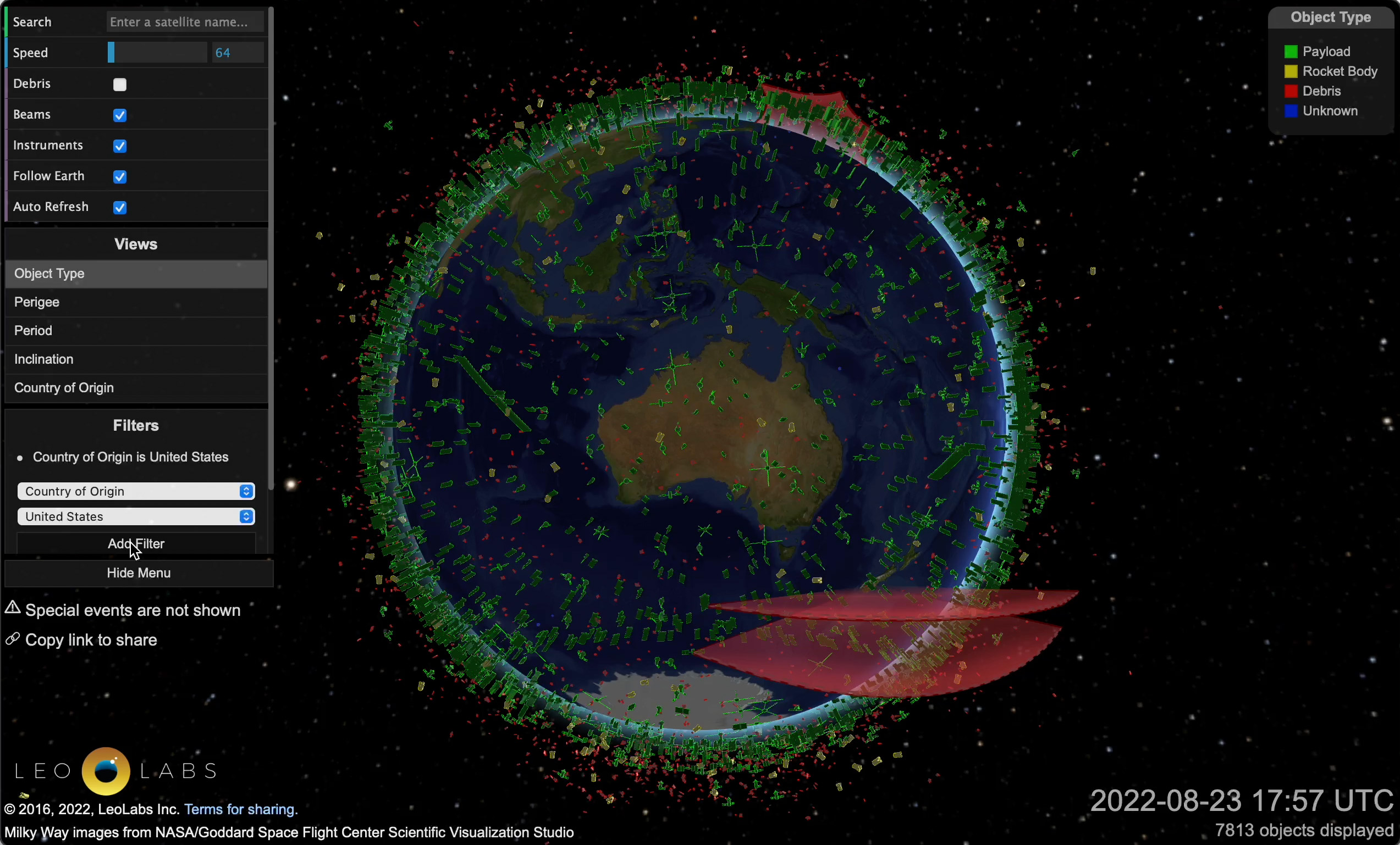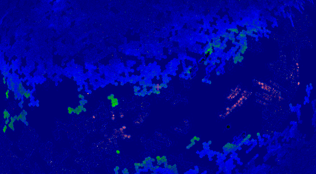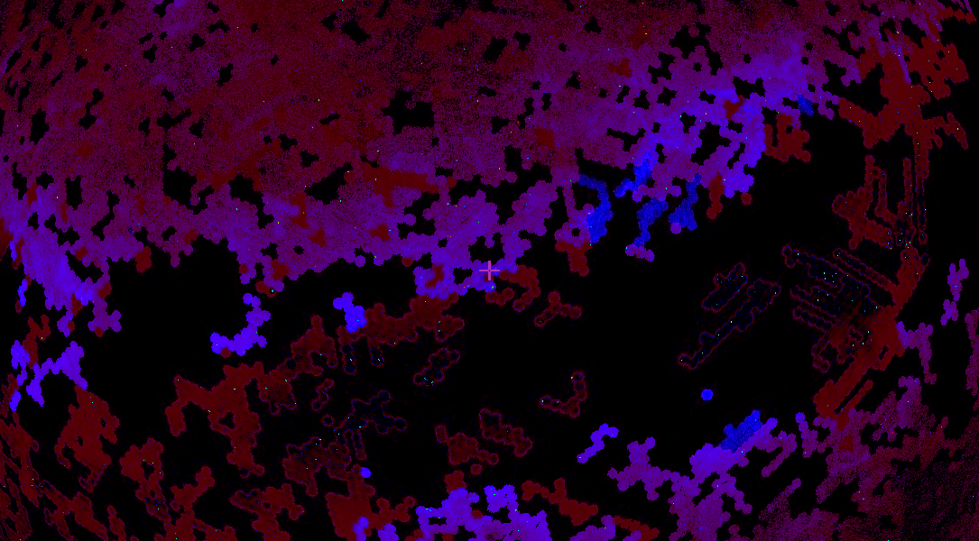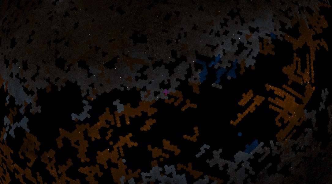
Following the previous video combining natural and artificial constellations, I keep searching for a way to visualise the paradox of images and data that satellites both generate, and contaminate.
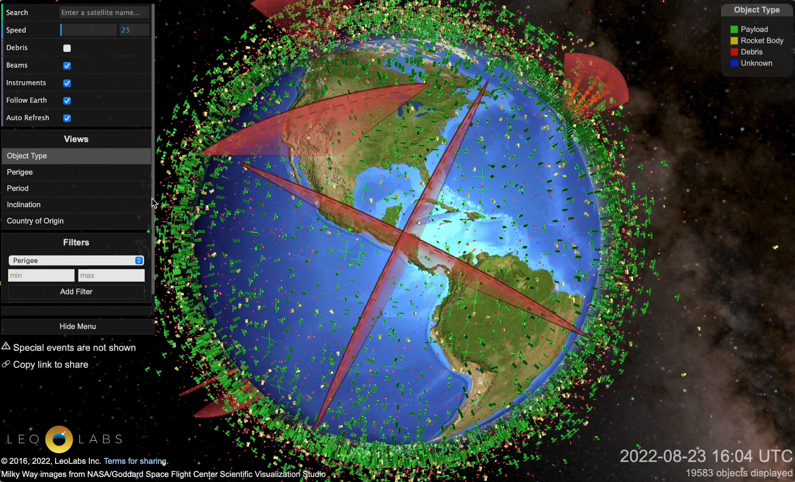
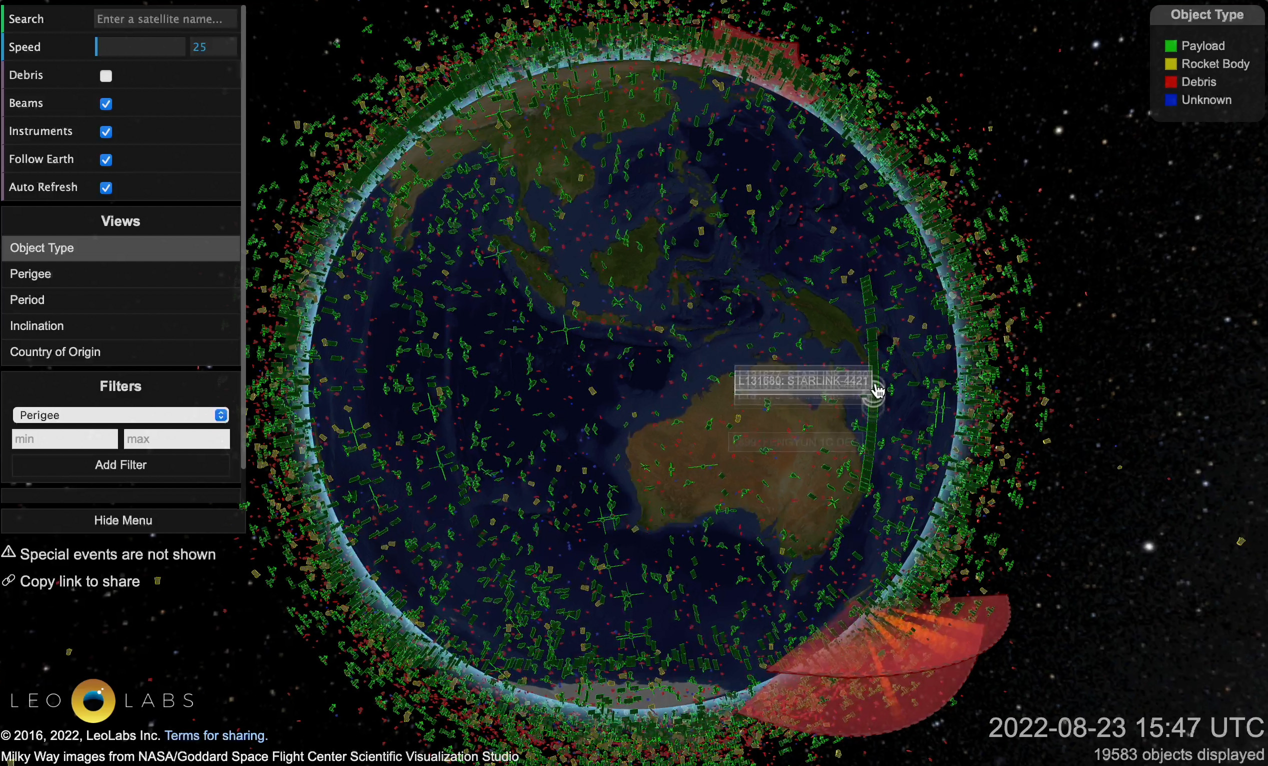
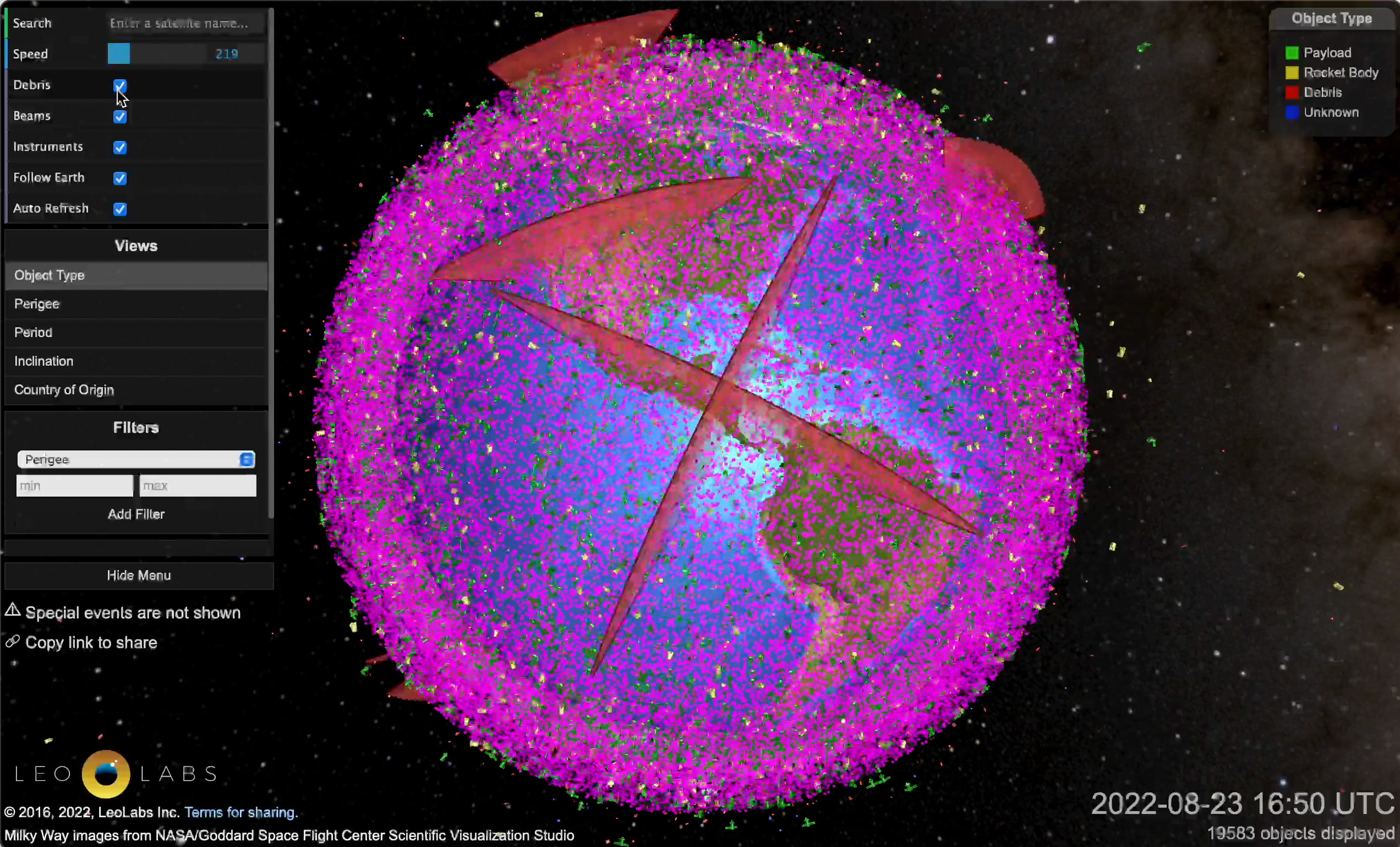
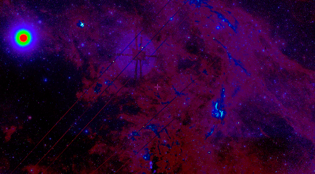
I asked Brad if there was a way to see a live view of the satellites passing an exact location using RA / dec coordinates. While not exactly what I’m looking for, this site generates live sky views that includes both natural and artificial sky objects. It also shows the orbits of satellites as you select them.
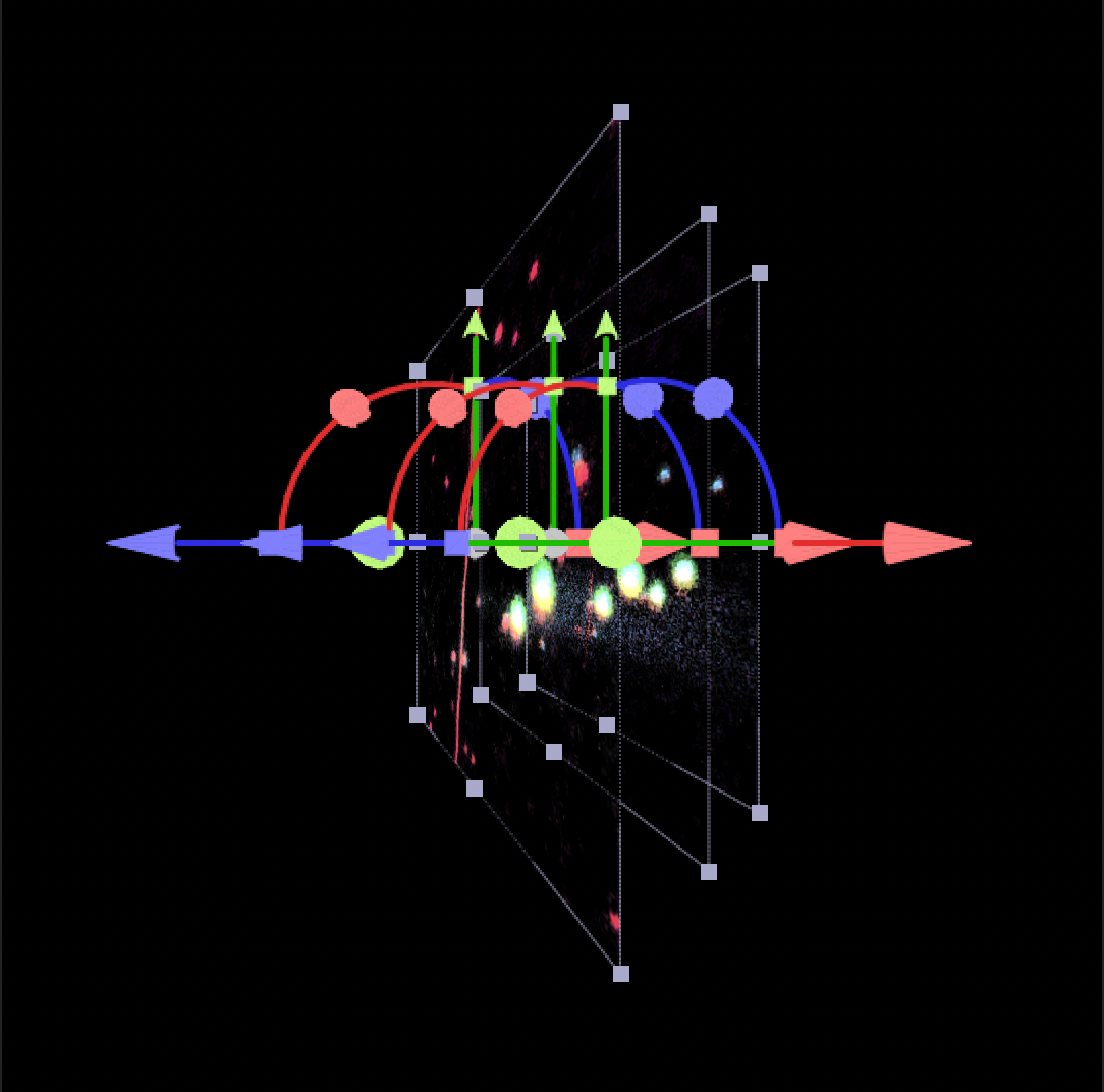
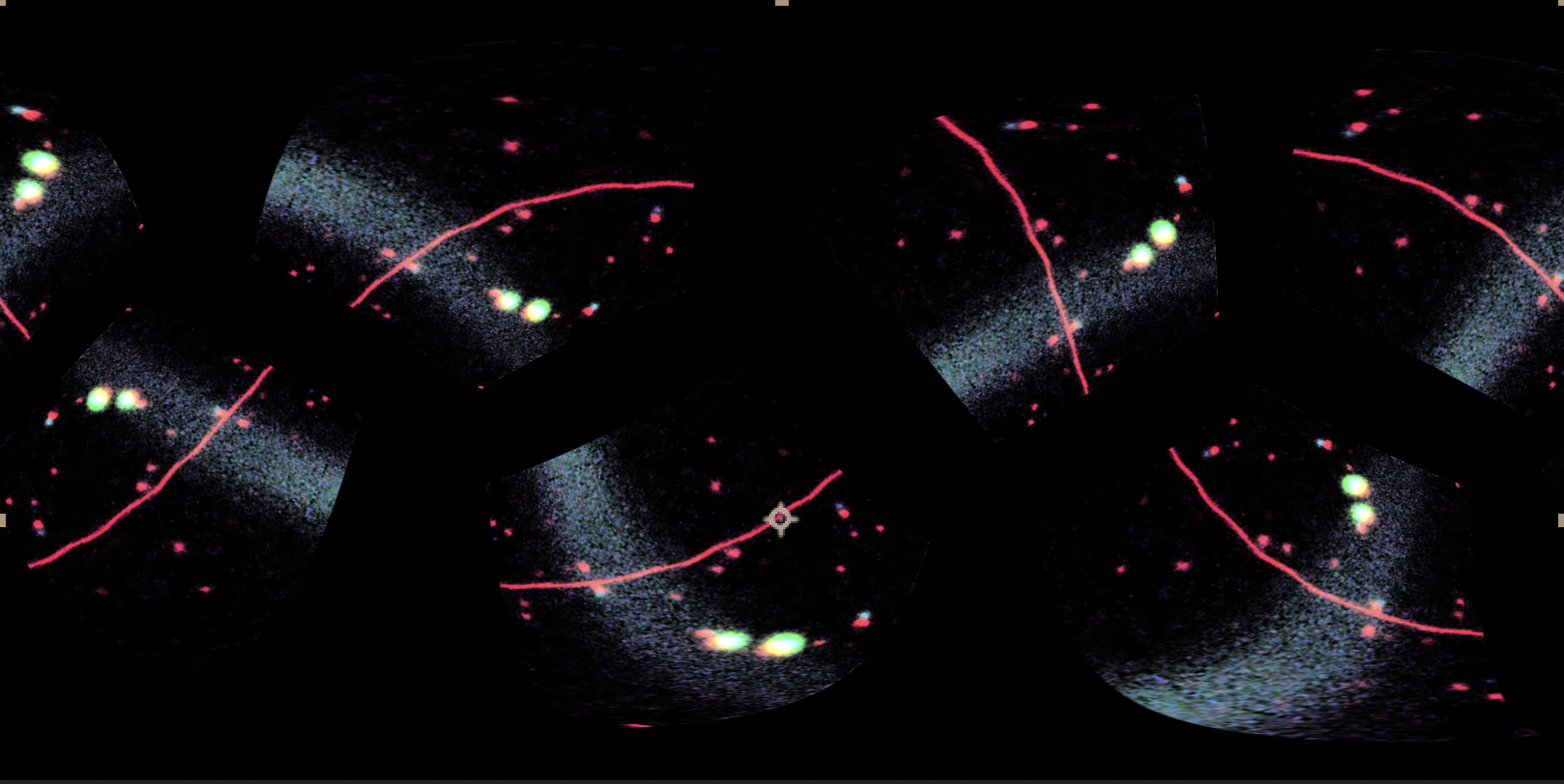
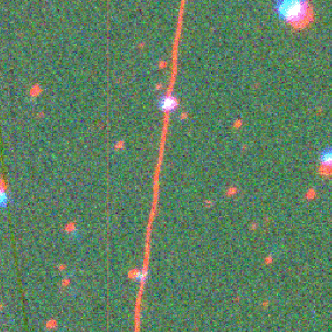
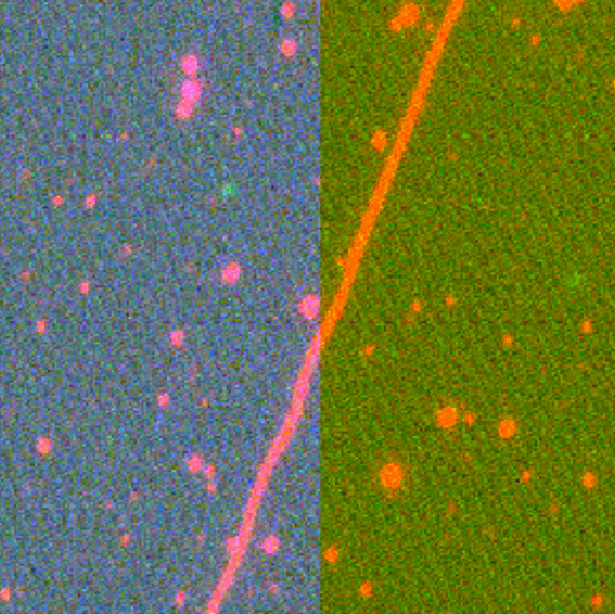
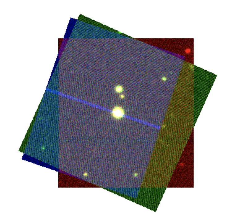
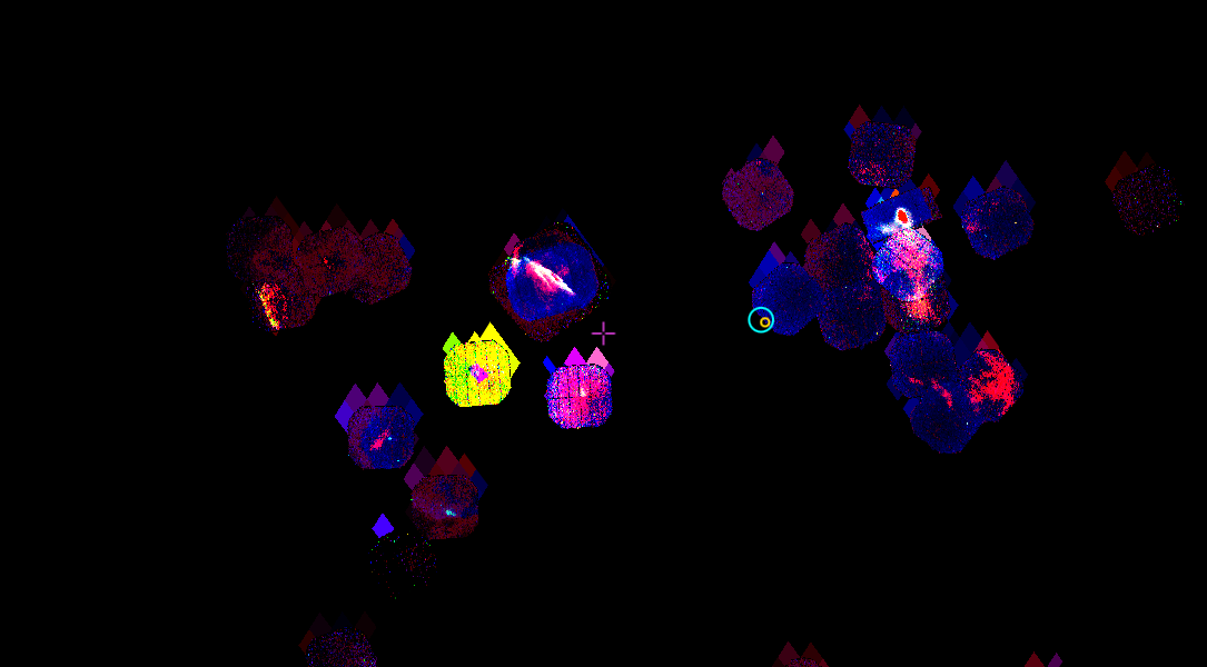
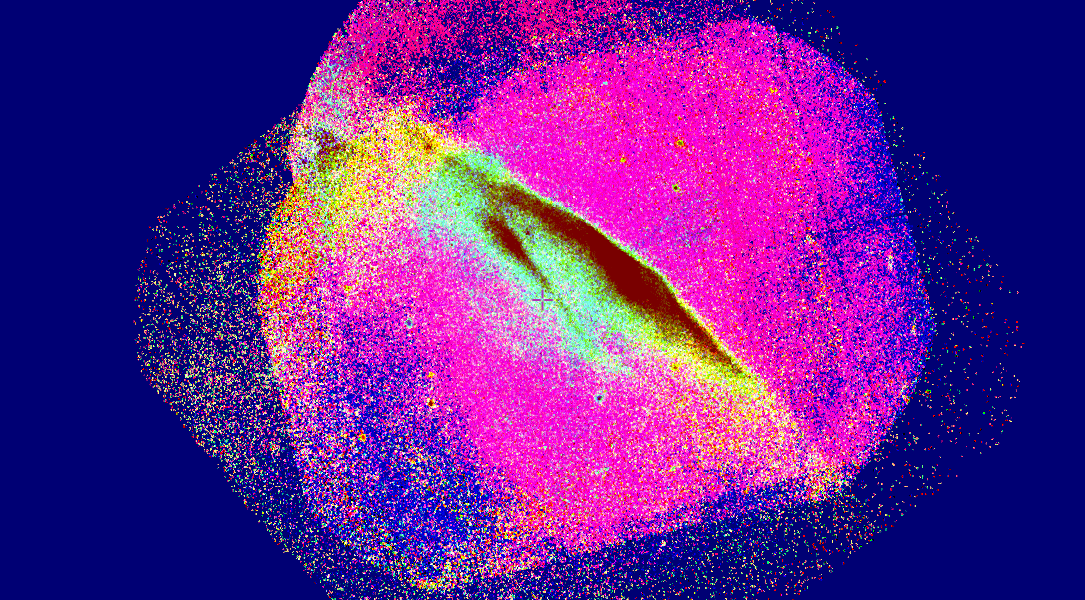
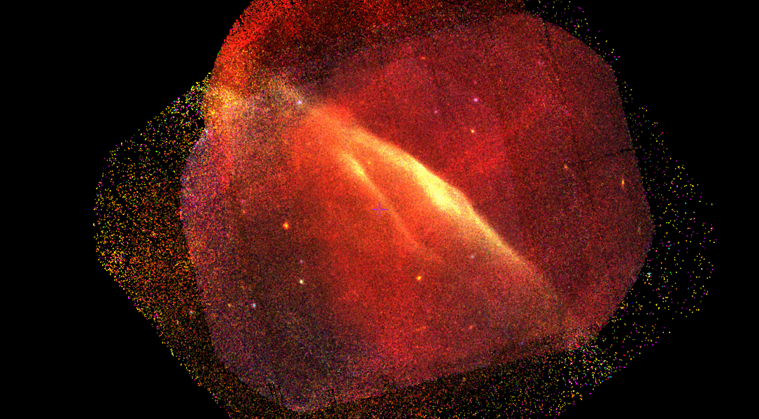
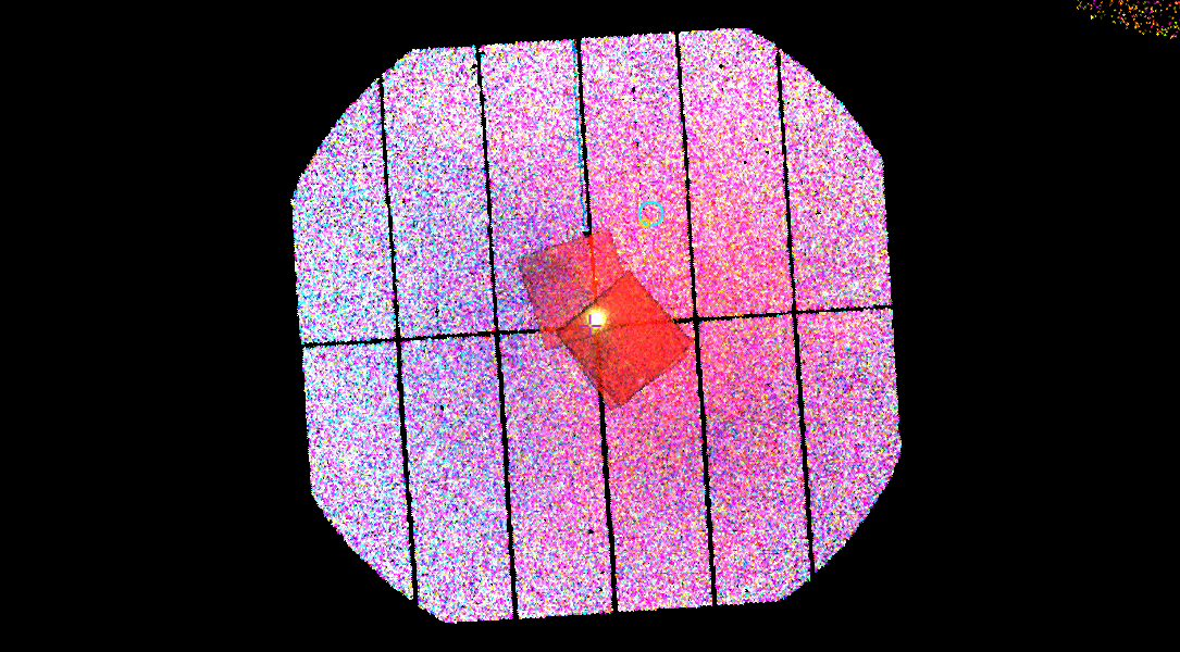
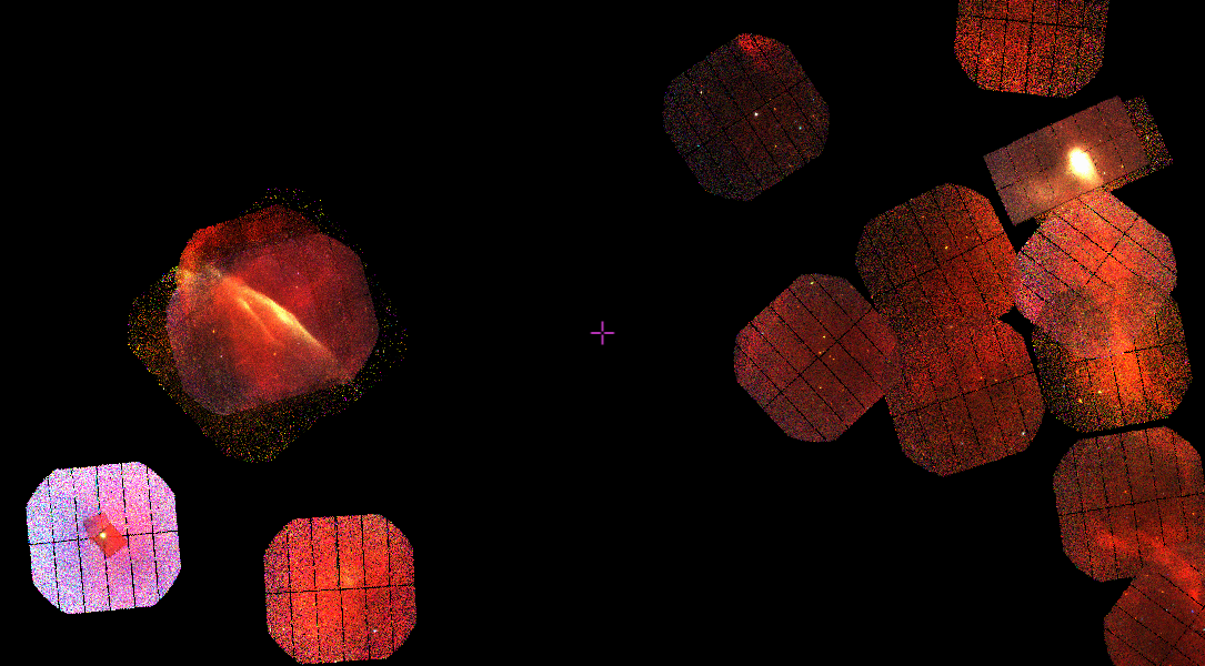
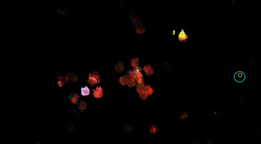
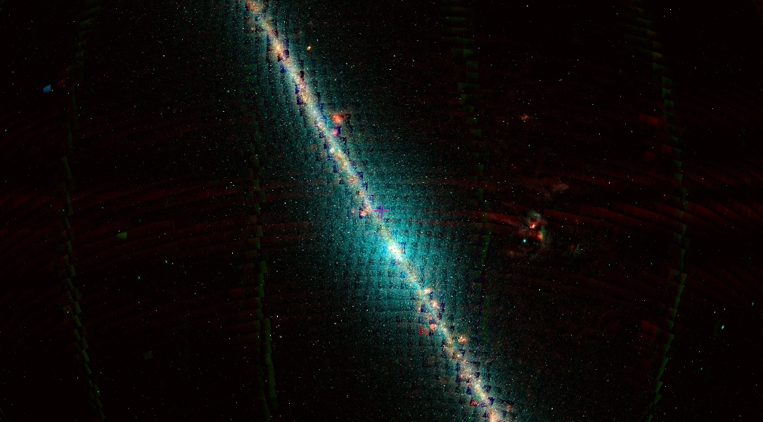
I wanted to expand on my previous video to also include the ‘inverted astronomy’ that Gärdebo et al and Sloterdjik describe as ‘looking down from space onto the earth rather than from the ground up into the skies’, to synthesise images that satellites provide, with the presence of them as we look to the skies.
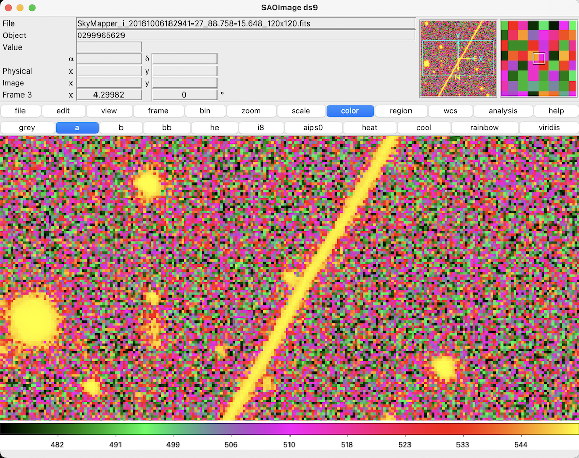
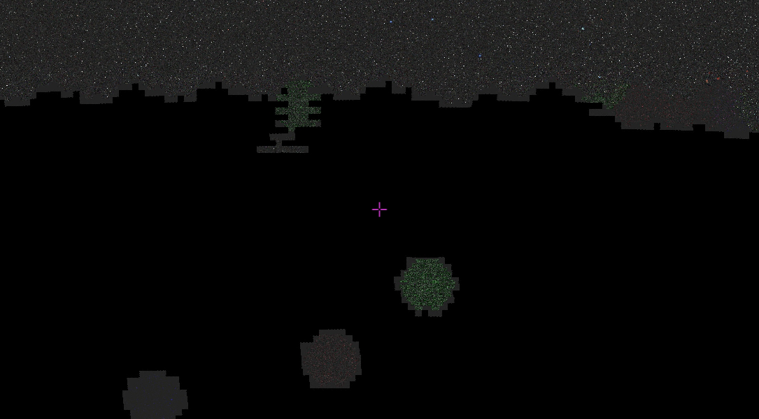
This animation combines a satellite image of the location that I generated the sky view for, combined with satellite and star positions at the time I took this screen recording.
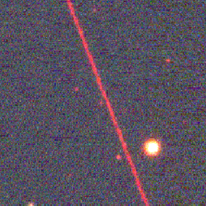
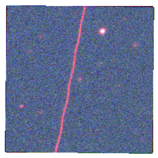
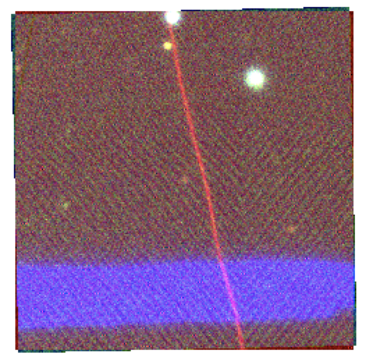
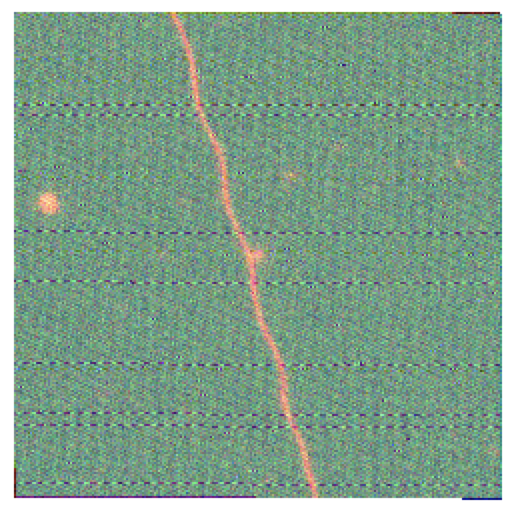
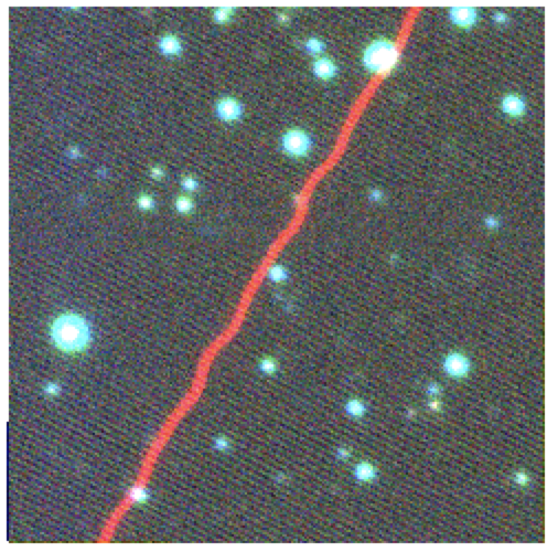
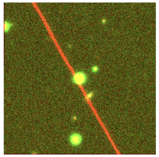
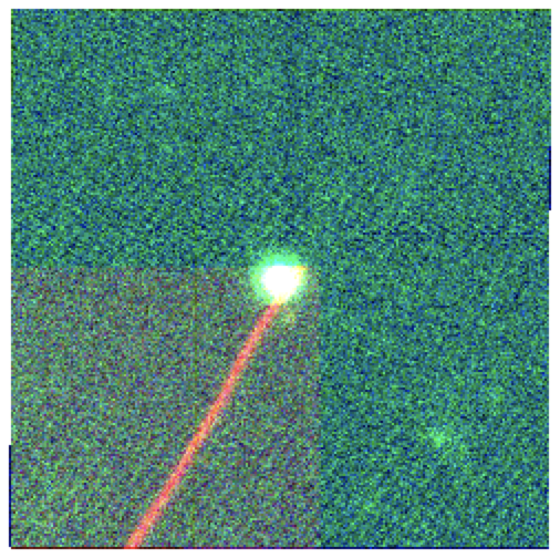
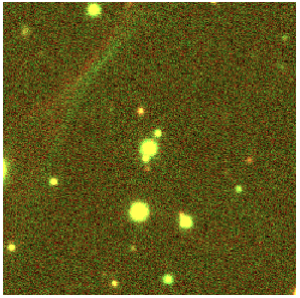
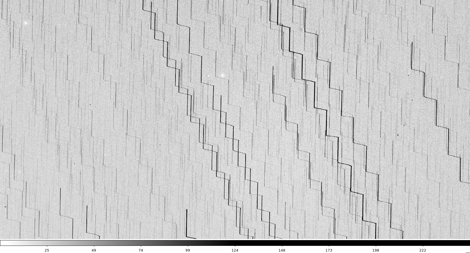
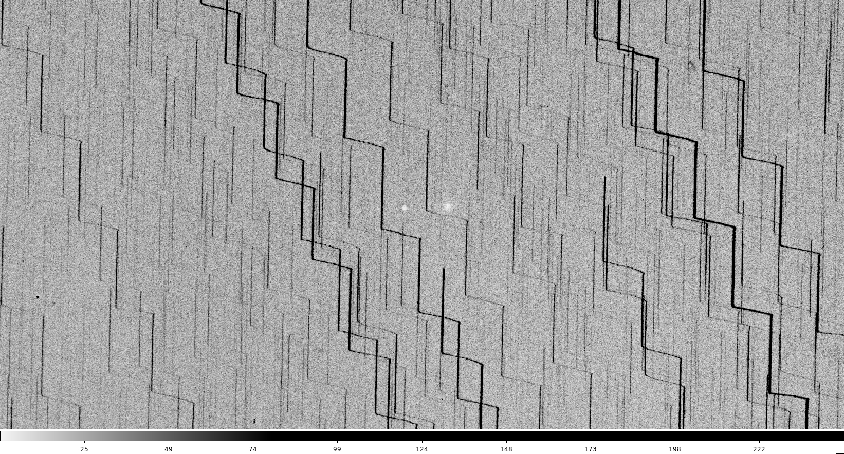
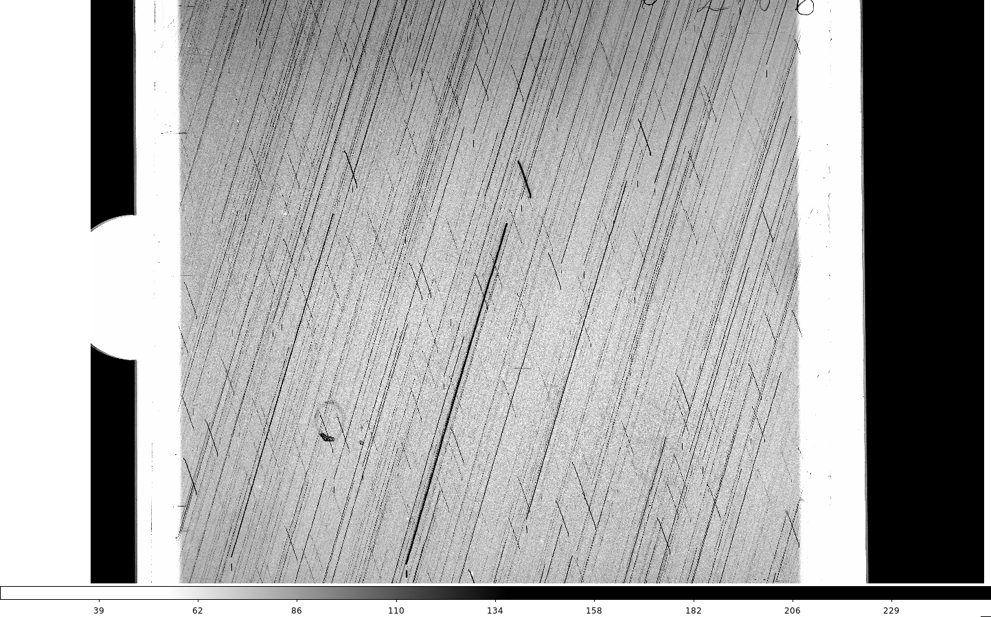
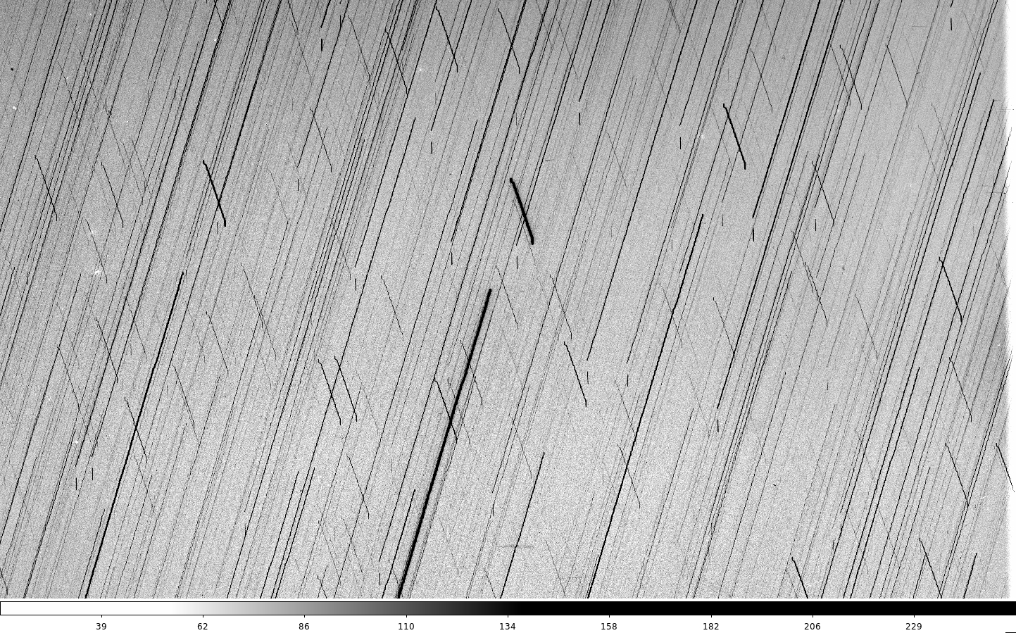
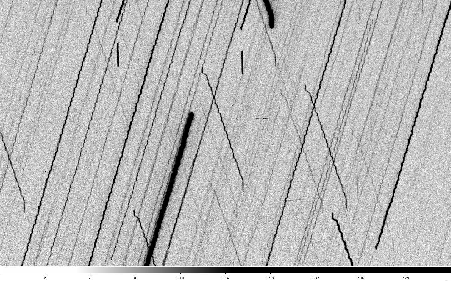
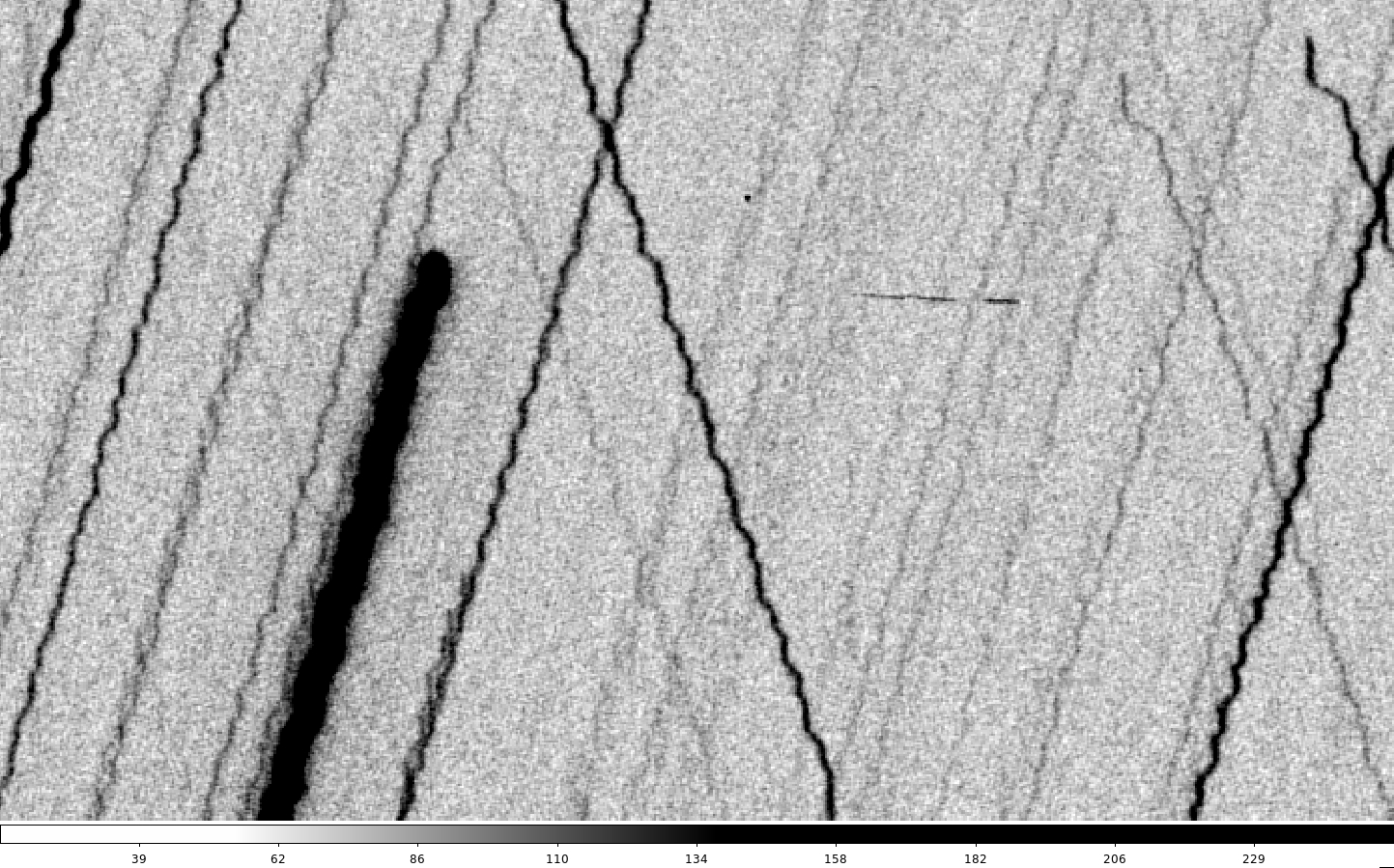
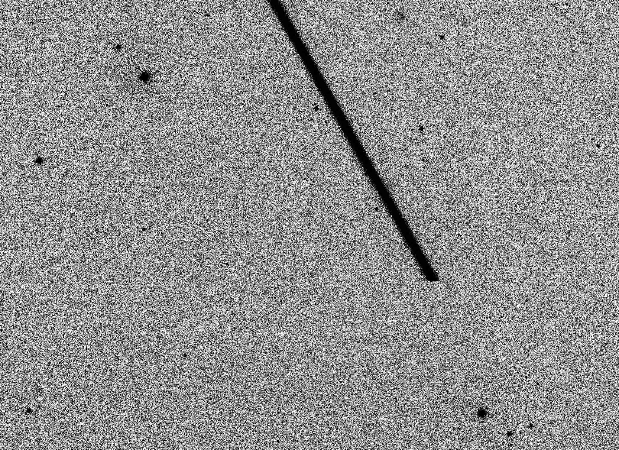
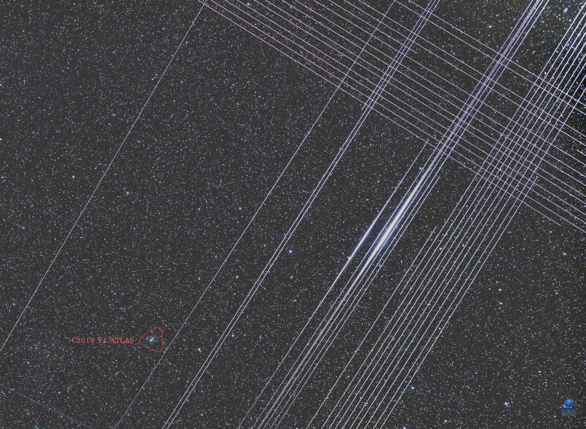
Compared to my last video, this one includes the ‘looking down’ perspective in terms of imagery, but leaves out the visualisation of the internet coverage the satellites provide. Also, drawing in the satellites’ orbital lines indicates the streaks they leave on astronomical images.
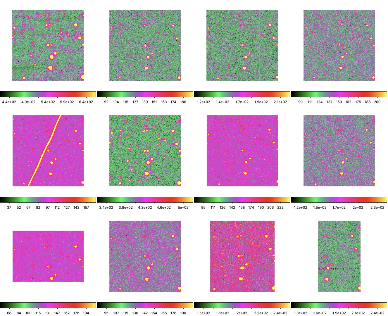
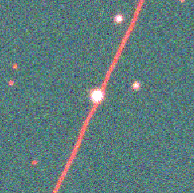
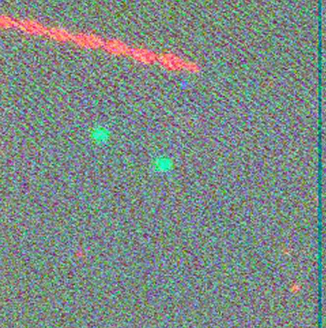
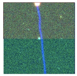
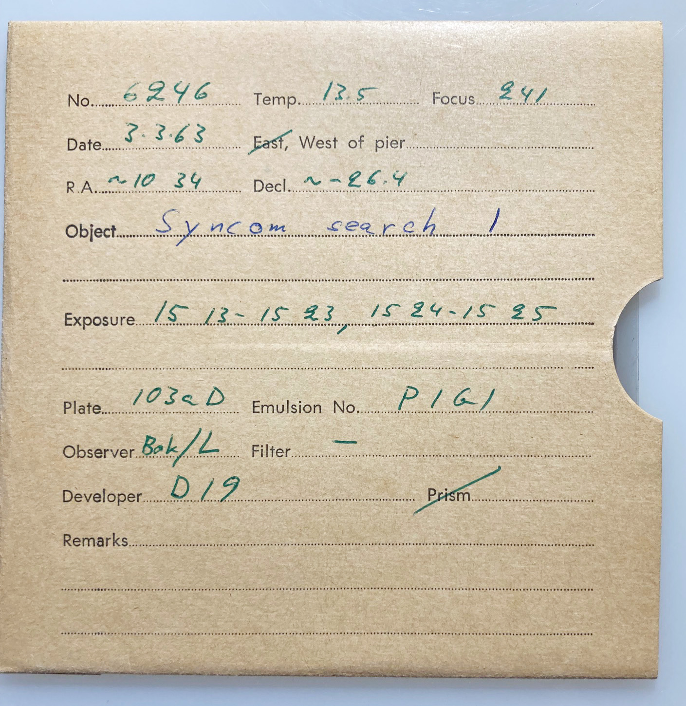
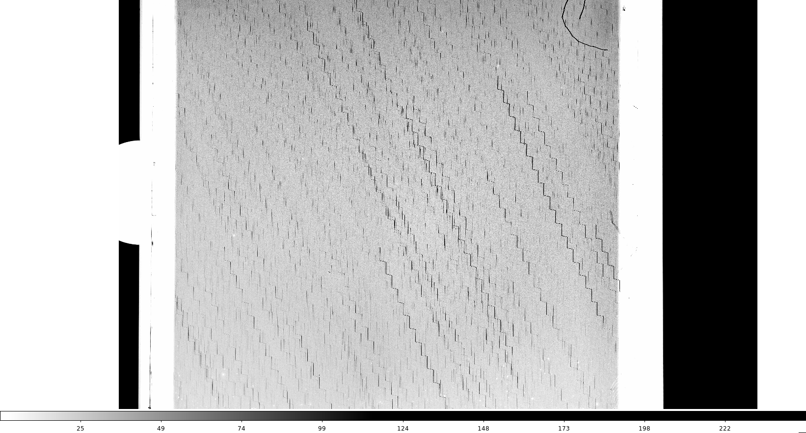
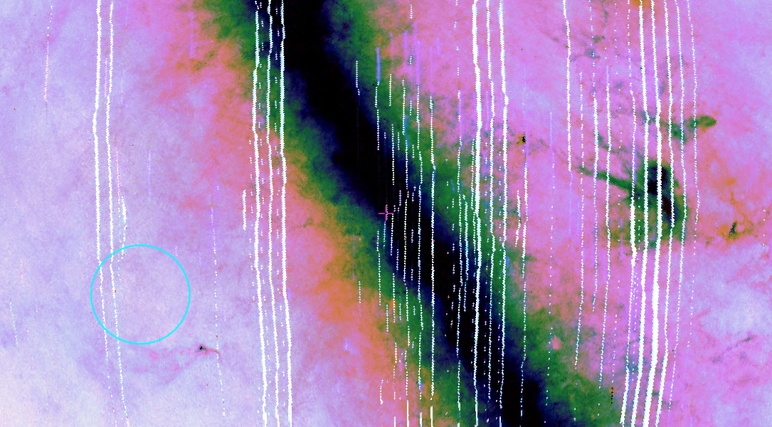
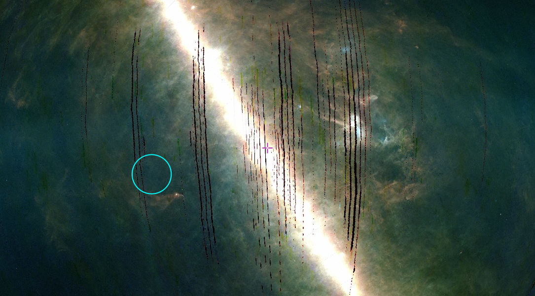
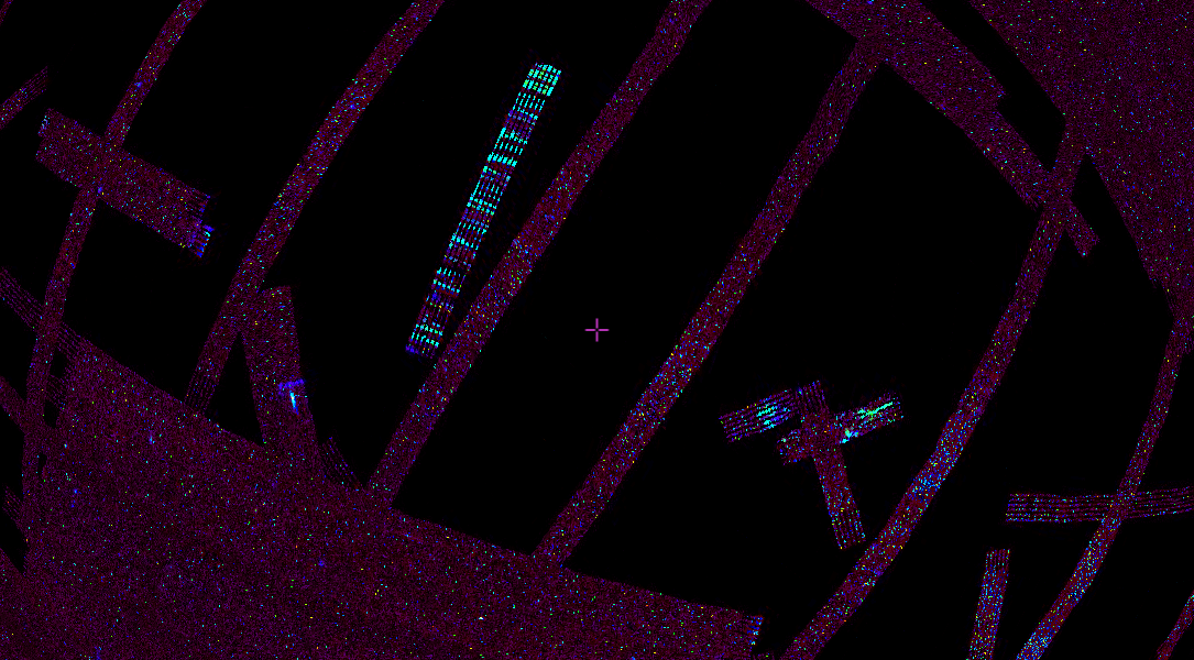
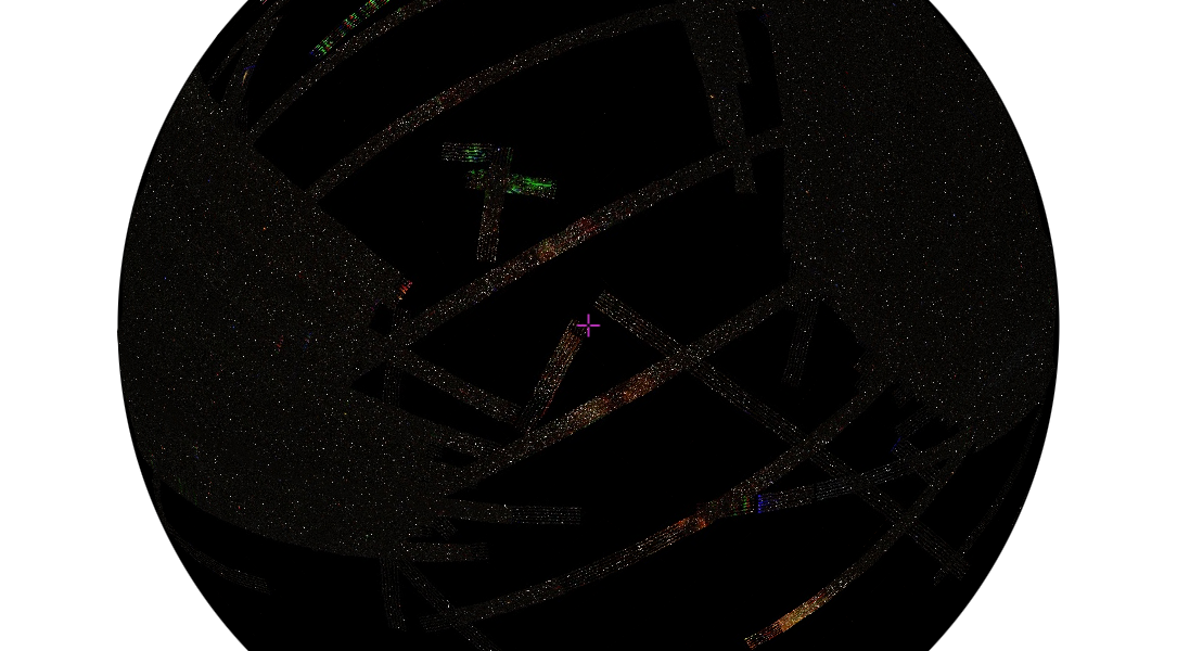
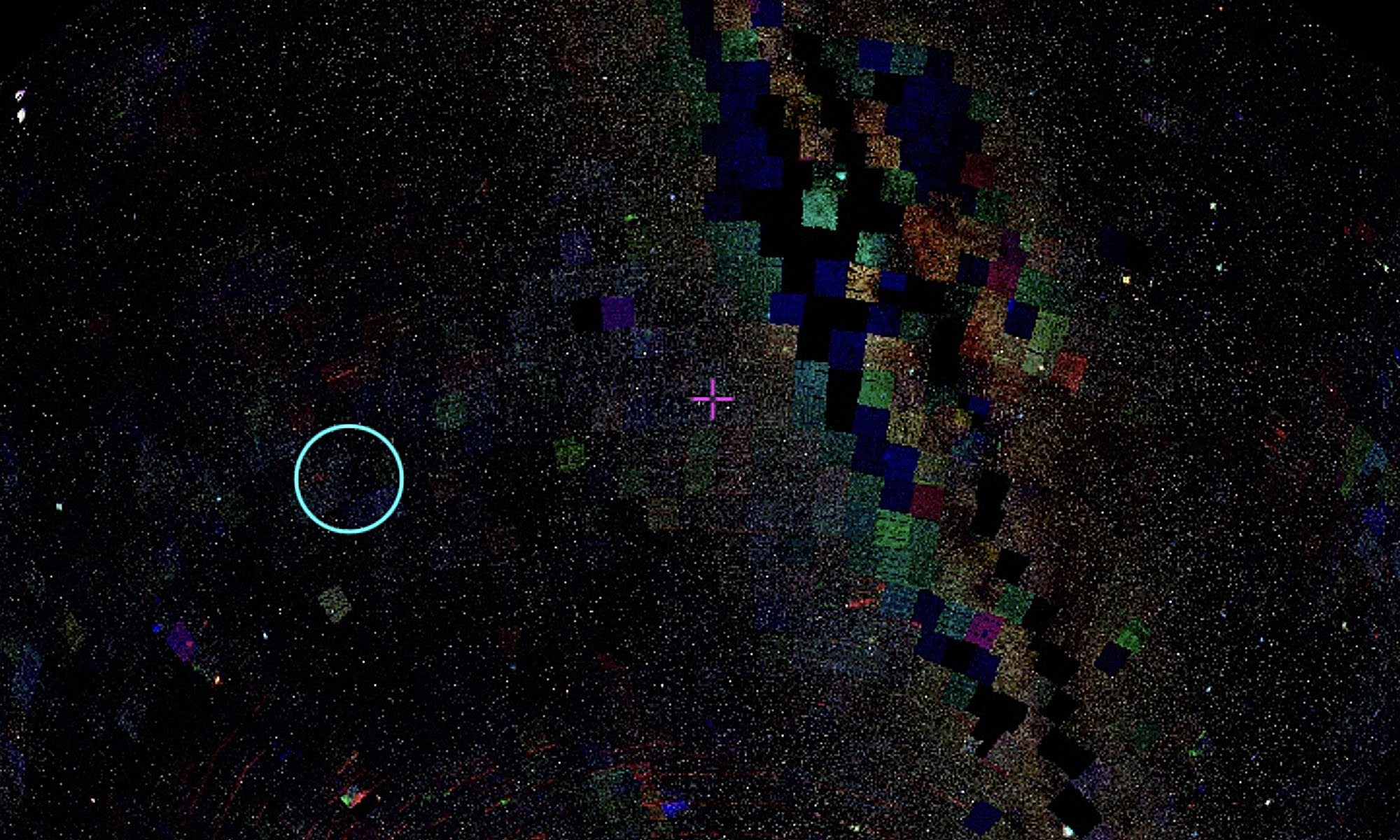
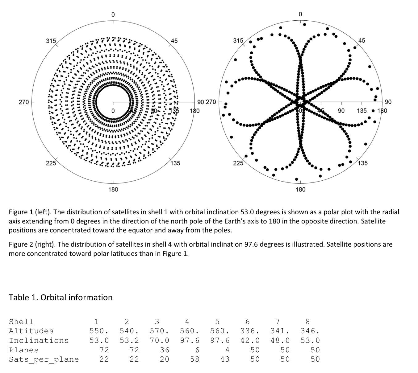
Starlink orbital shells
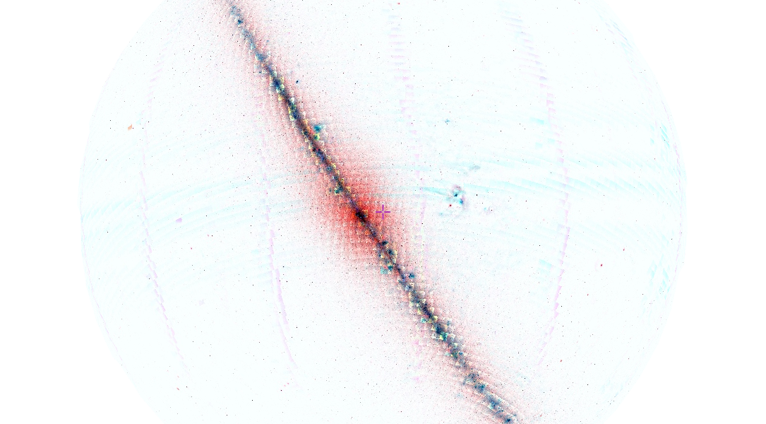
Anthony Mallama’s research shows how Starlink satellites will create eight orbital ‘shells’ at different altitudes. Examples of these shells at medium and high inclination are shown here:
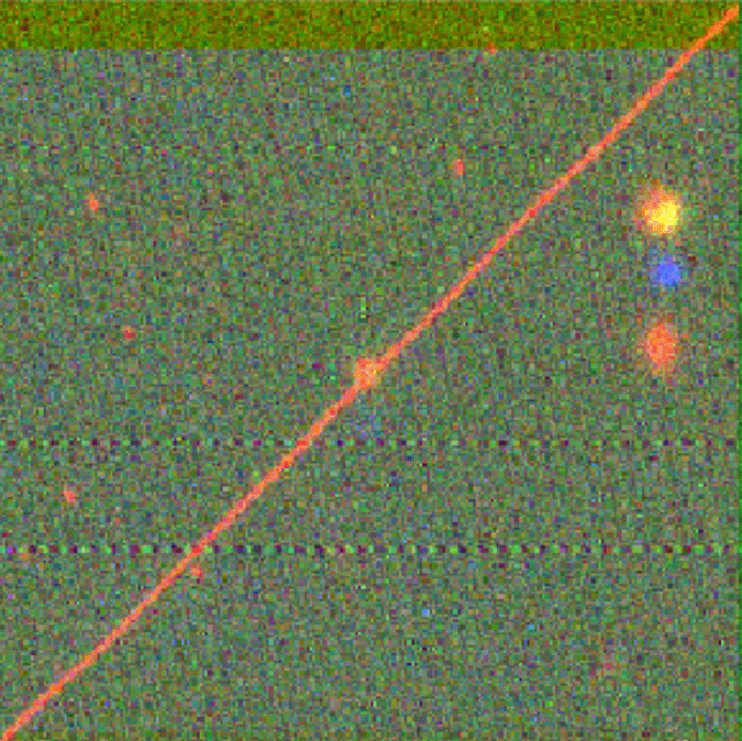
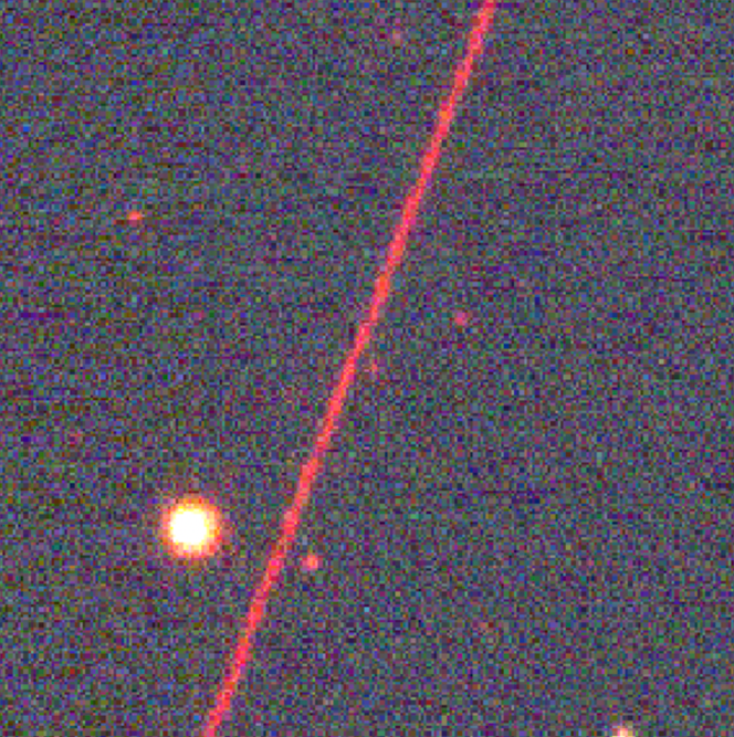
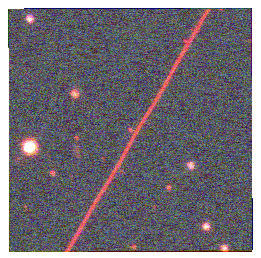
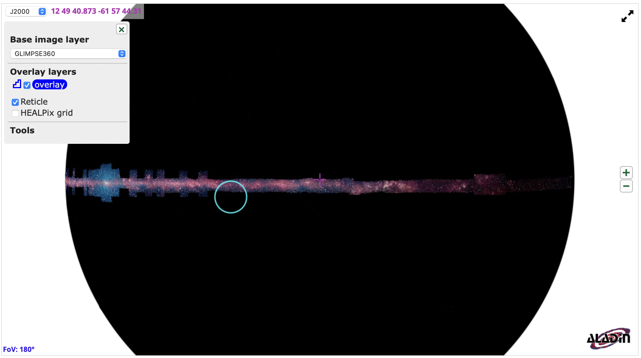
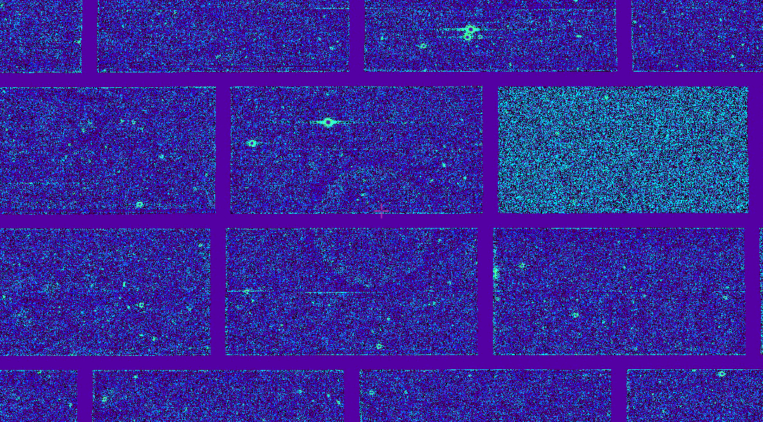
Orbital Debris Reentry Predictions
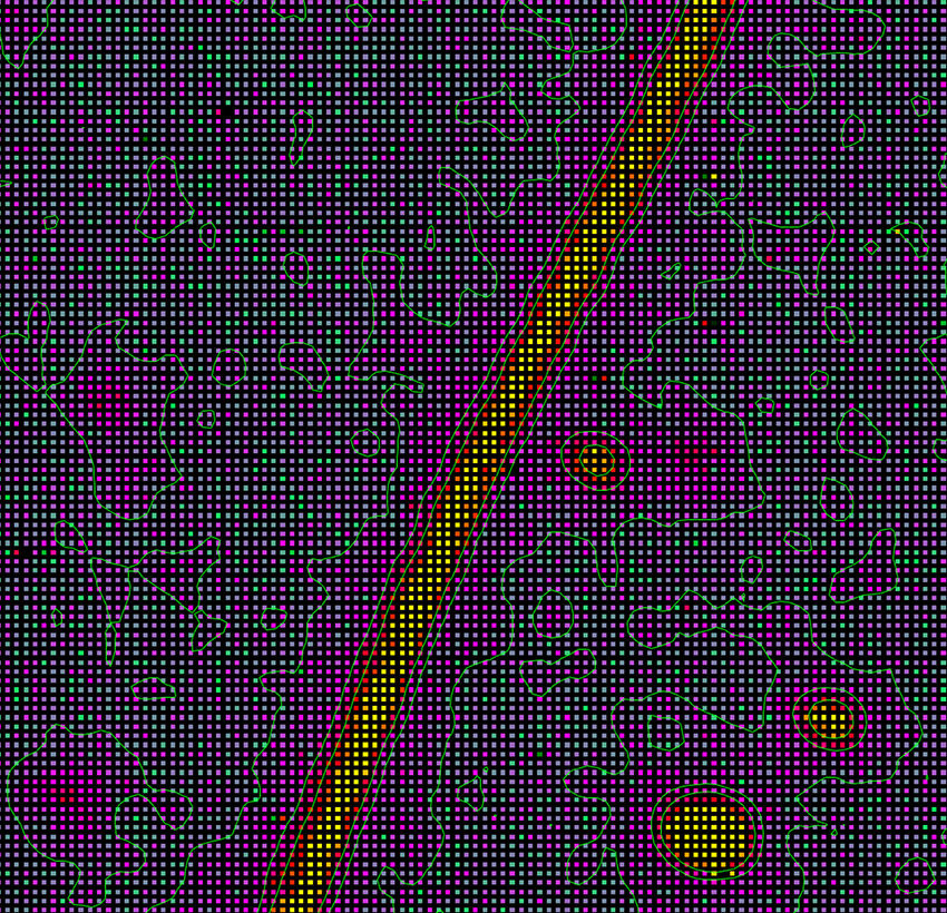
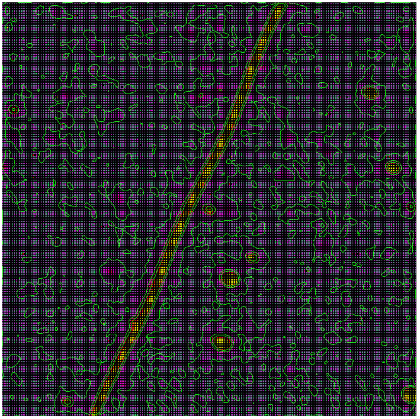
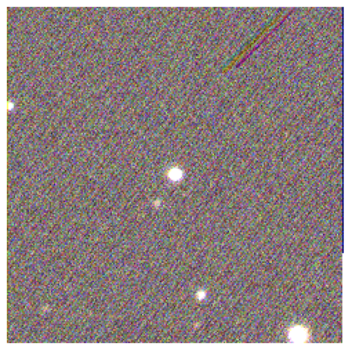
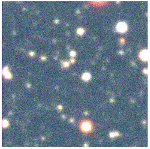
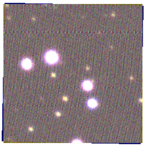
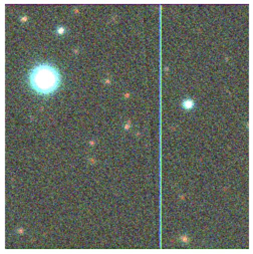
Orbits are also interesting because their exact path over time is unstable due to atmospheric drag, solar wind, and gravitational pull, which is why space debris is hitting the earth at unpredictable locations.
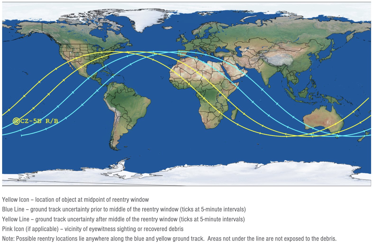
Image: Reentry prediction from the Aerospace Center for Orbital and Reentry Debris Studies on 3 Nov for the Long March 5B rocket body launched 31 Oct. Credit: The Aerospace Corporation